The flight booking experience faced critical usability issues, unclear pricing, and inconsistent UI, leading to high drop-off rates and reduced user trust.
Solution
Redesigned the Flights product by transitioning from Webview to a Native app, improving core features, and creating a seamless mobile experience.
Impact
App Ratings: Improved from 2.0 to 4.6.
Checkout Conversion: 212.5% increase.
Book Finish: 6.51% increase
DISCOVERY
While I was not directly responsible for the research phase, I built upon the findings from our research team, ensuring that their valuable insights shaped the design solutions. Rather than revisiting the discovery phase extensively, I made informed decisions based on existing user pain points and competitive benchmarks.
Experience Mapping
Conducted a detailed analysis of the current user journey to uncover friction points and identify opportunities for improvement.
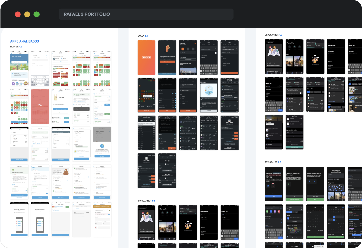
Simple Benchmarking
Performed a basic benchmark analysis with top travel apps to gather insights and best practices relevant to flight booking experiences.
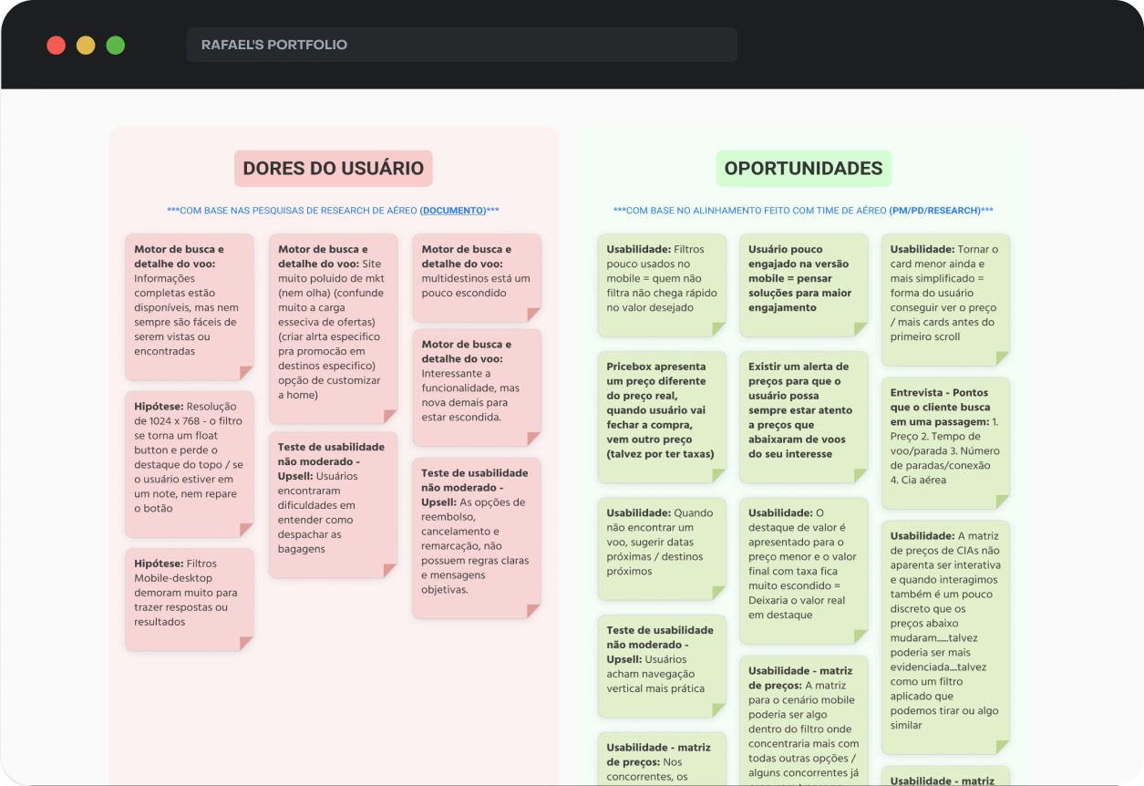
Pain Points & Opportunities
Reviewed existing research documents to extract key pain points and business opportunities, aligning them with user needs.
This lean discovery process allowed me to focus on what mattered most, balancing user needs with business priorities while ensuring timely delivery of impactful design solutions.
DEFINITION & IDEATION
Success Metrics
Defined clear success metrics focusing on user retention, conversion rates, and reduction of technical issues.
Current Performance
Reviewed key data from Mixpanel to understand baseline conversion rates and user behavior patterns.
Feature Benchmark Flow
Analyzed competitors’ flight booking flows to identify strengths and opportunities for differentiation.
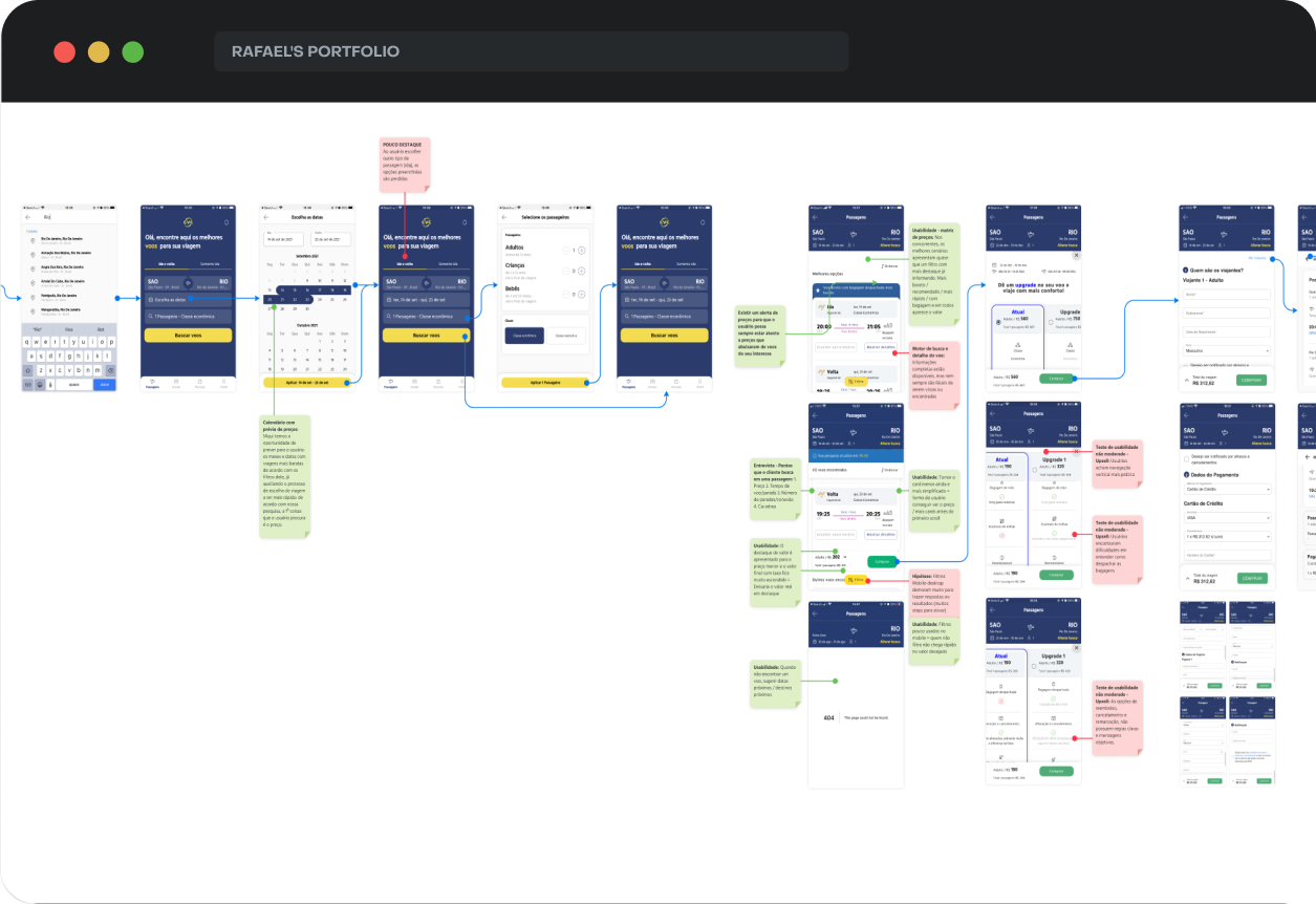
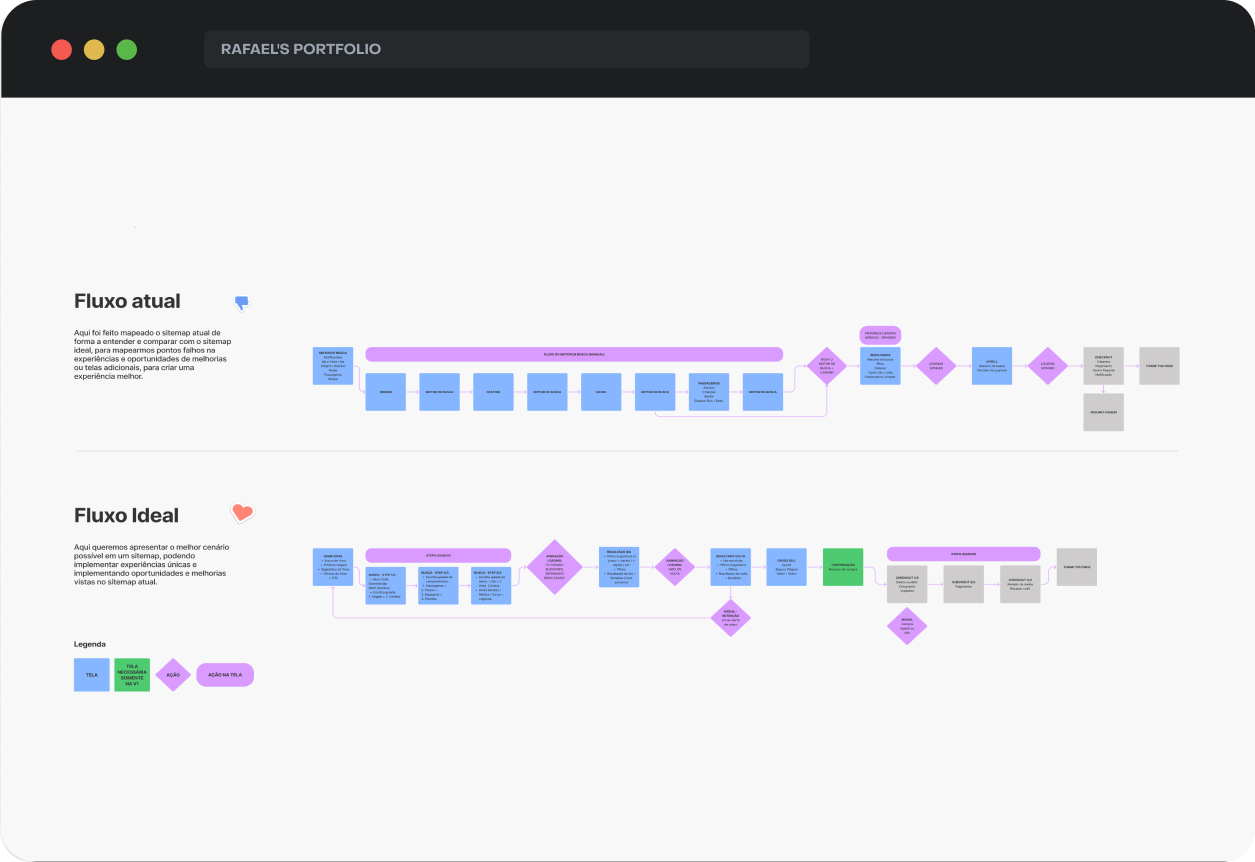
New User Flow
Redesigned the user flow, comparing the old version with the new, optimized journey to improve efficiency and reduce friction points.
DESIGN & VALIDATION
Medium
fidelity
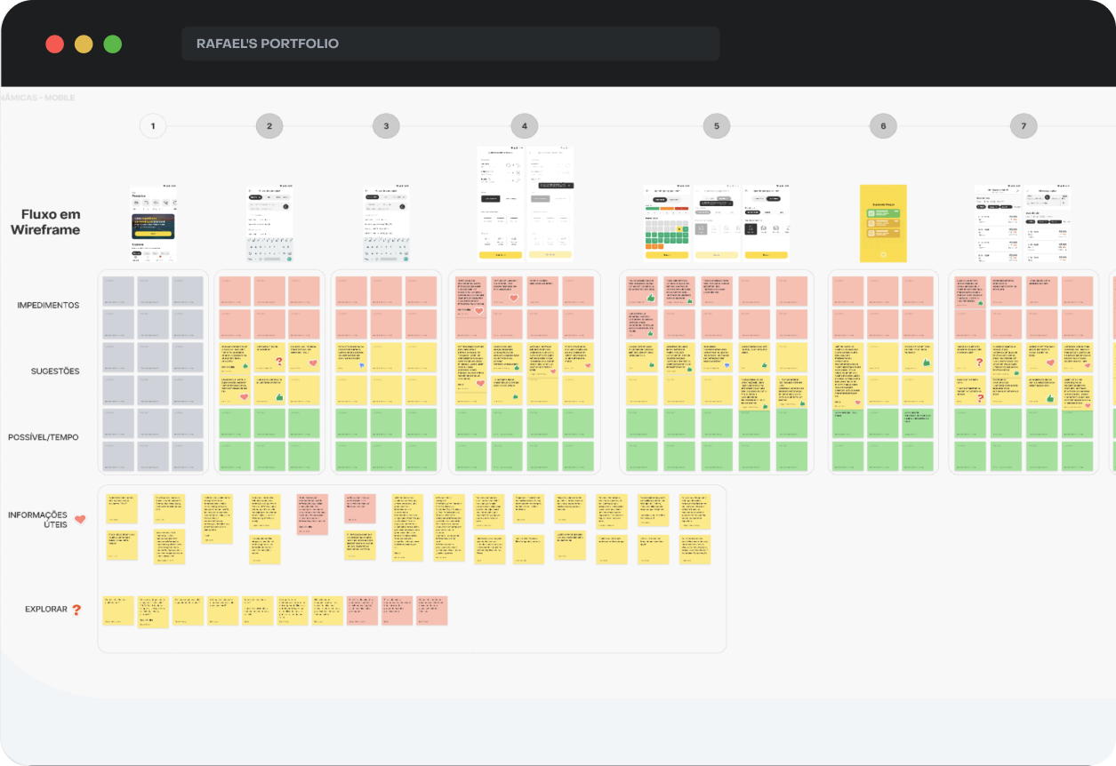
Created medium-fidelity prototypes to validate design hypotheses through A/B testing with users, allowing for early feedback and data-driven decisions.
Design
Critique
Facilitated design critique sessions with the squad, encouraging active participation from all team members to share opinions, suggestions, implementation efforts, and new ideas to refine the solution collaboratively.
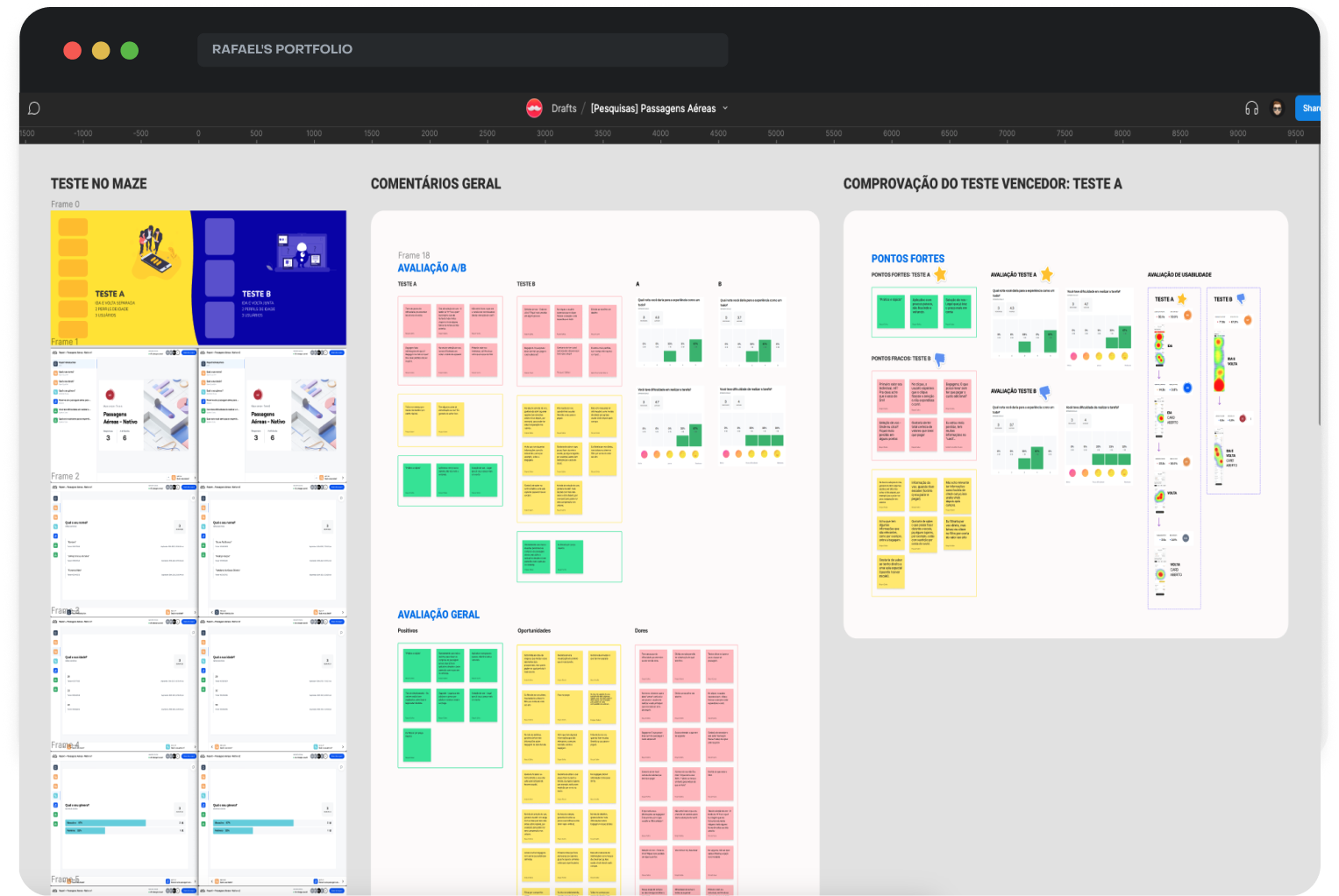
A/B Testing
Conducted A/B tests using prototypes to evaluate design variations on card sizes with outbound and return together or separated and measure user engagement.
Usability Test Results
Analyzed the A/B test outcomes, showcasing significant improvements in task completion rates and user satisfaction.
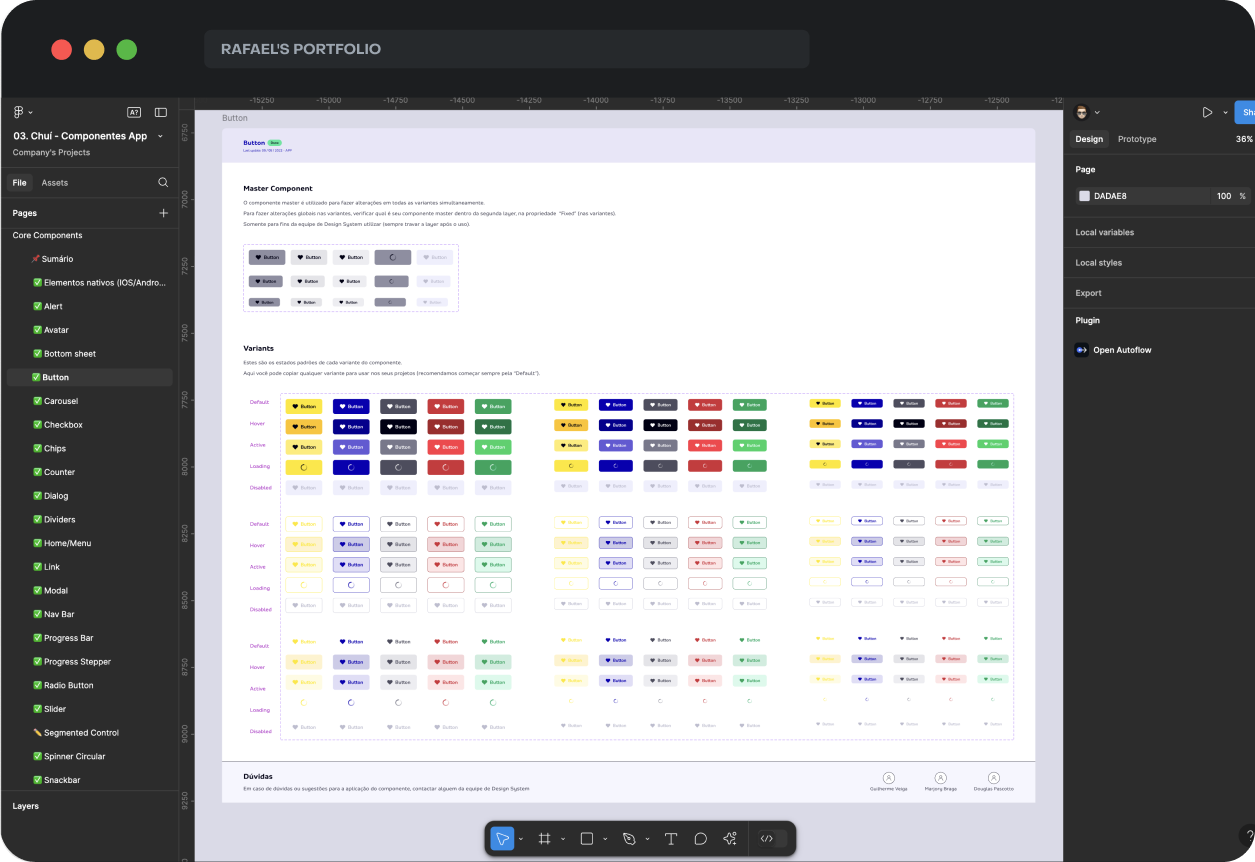
Component Library
Contributed to building a new component library aligned with the updated design system, ensuring consistency and scalability across the app.
FINAL SOLUTION
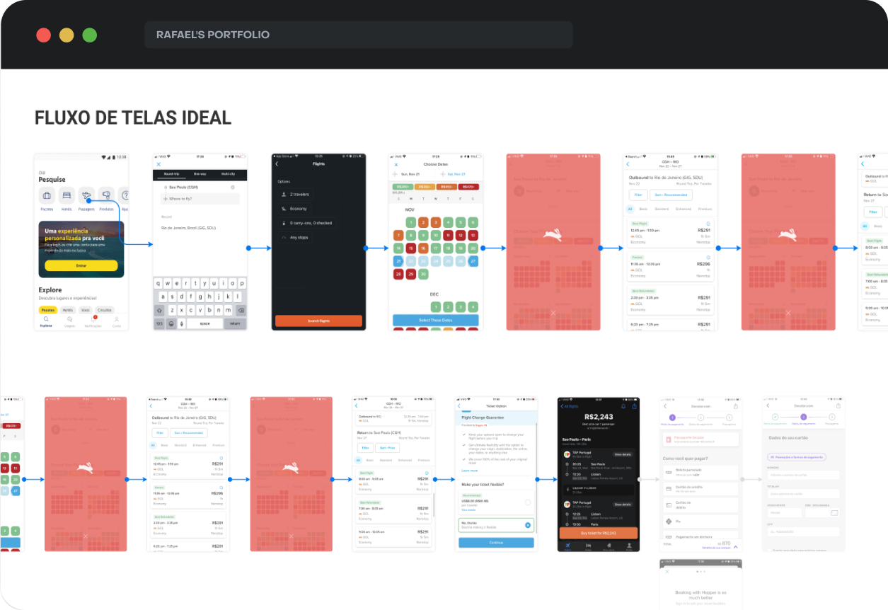
The final solution focused on delivering a seamless, intuitive, and high-performance native flight booking experience. To highlight the improvements, I’ve included comparisons between the previous web-view version and the new native design.
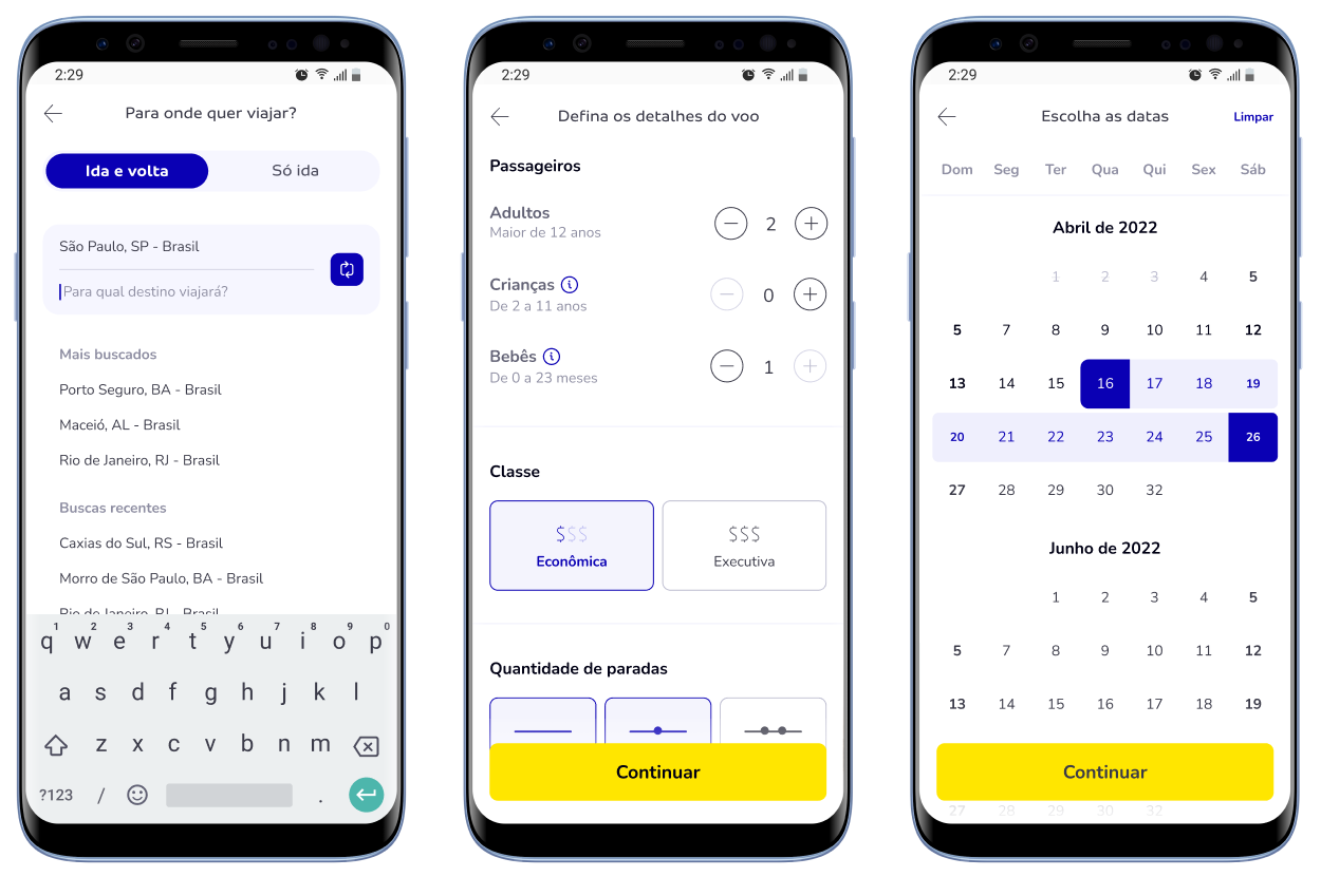
Search Steps
Designed an intuitive search process with smart suggestions, making it easy for users to find destinations, set dates, and receive fast, accurate results.
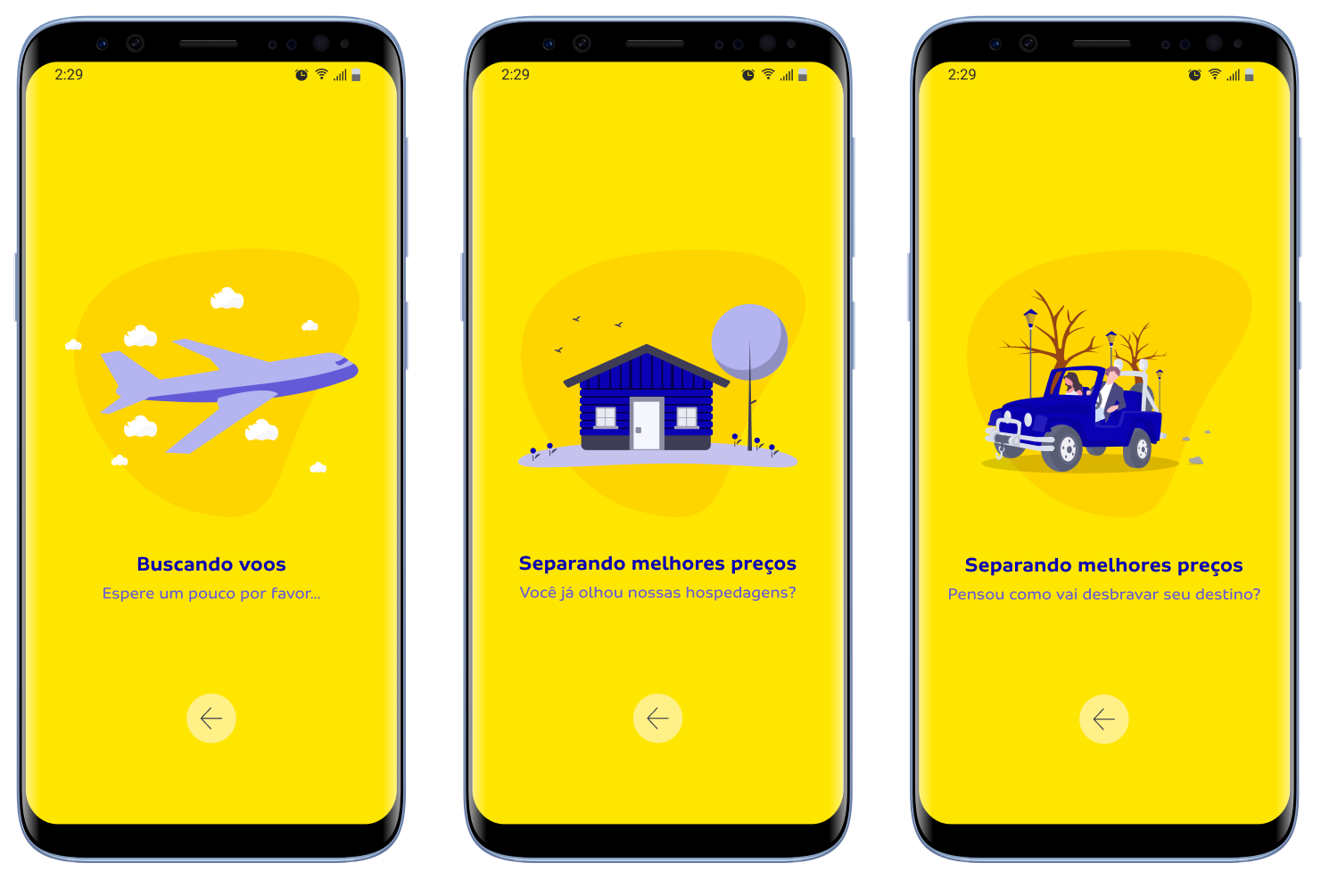
Loading Animations
Added engaging animations to cover long load times, clearly informing users of the ongoing process to reduce frustration.
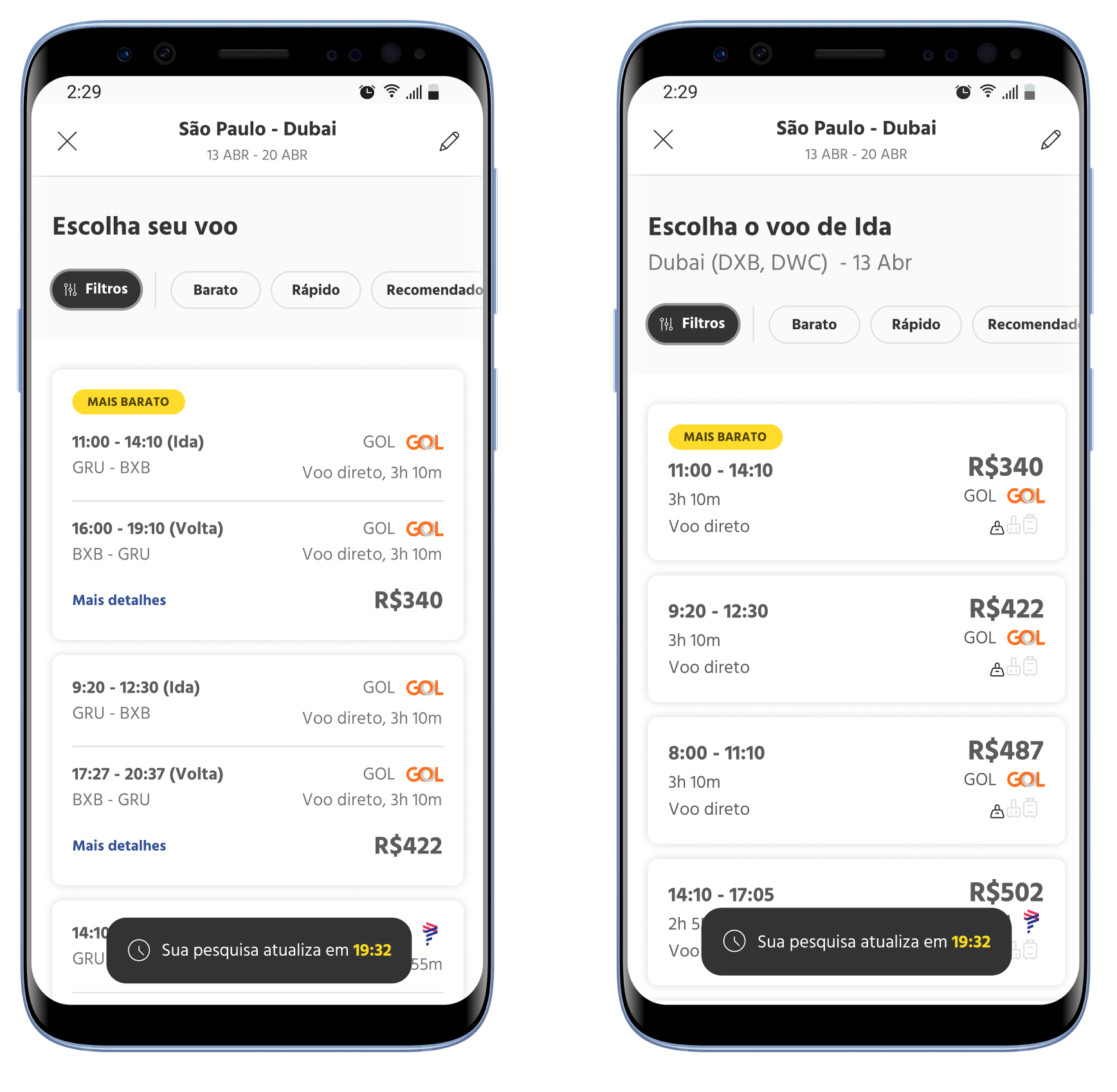
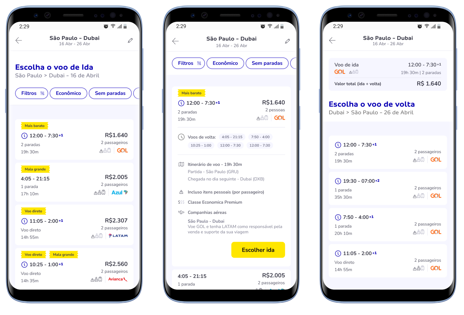
Compact results
Implemented compact flight cards that display essential information, allowing users to quickly select outbound flights without the confusion of excessive return flight combinations.
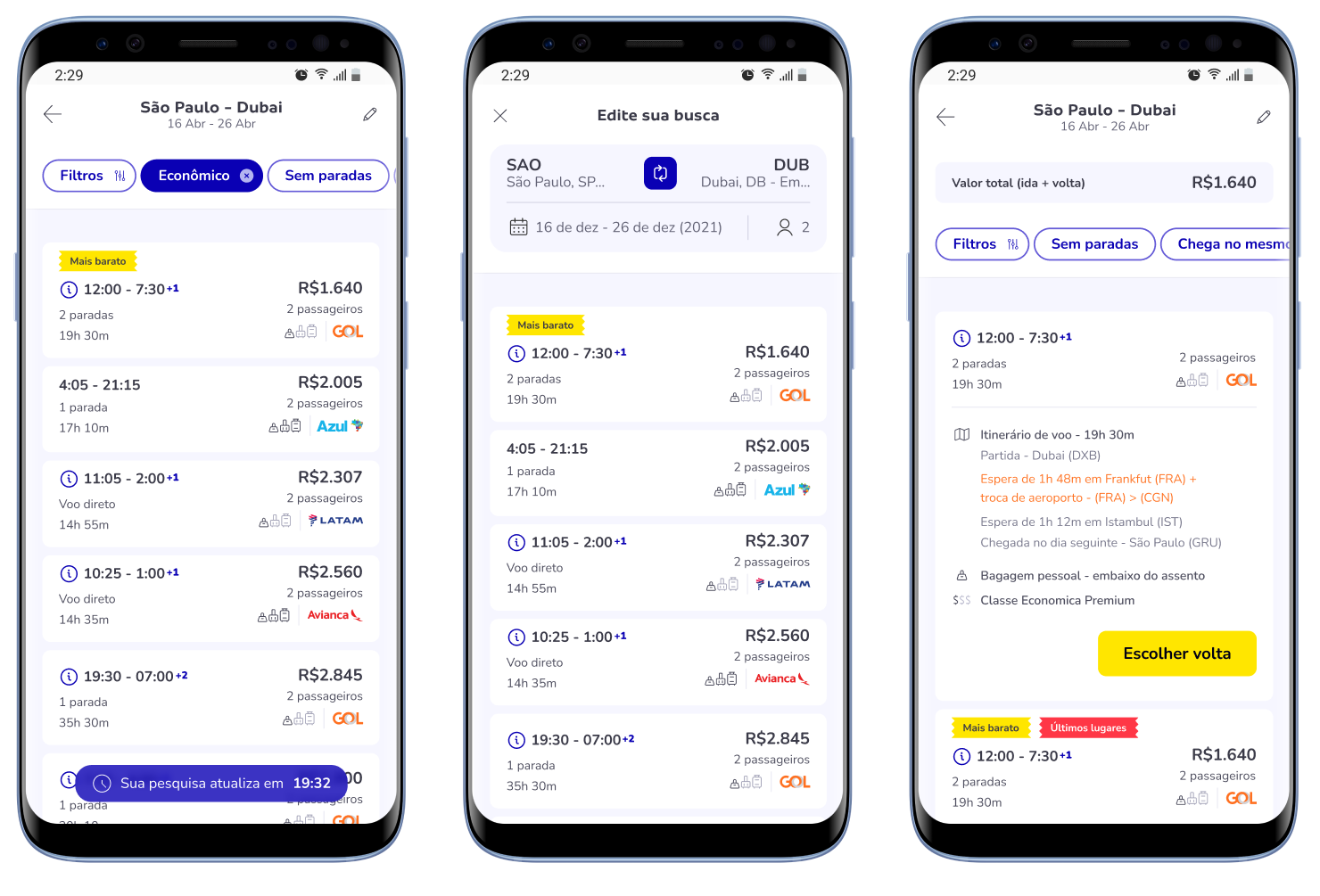
Search Details
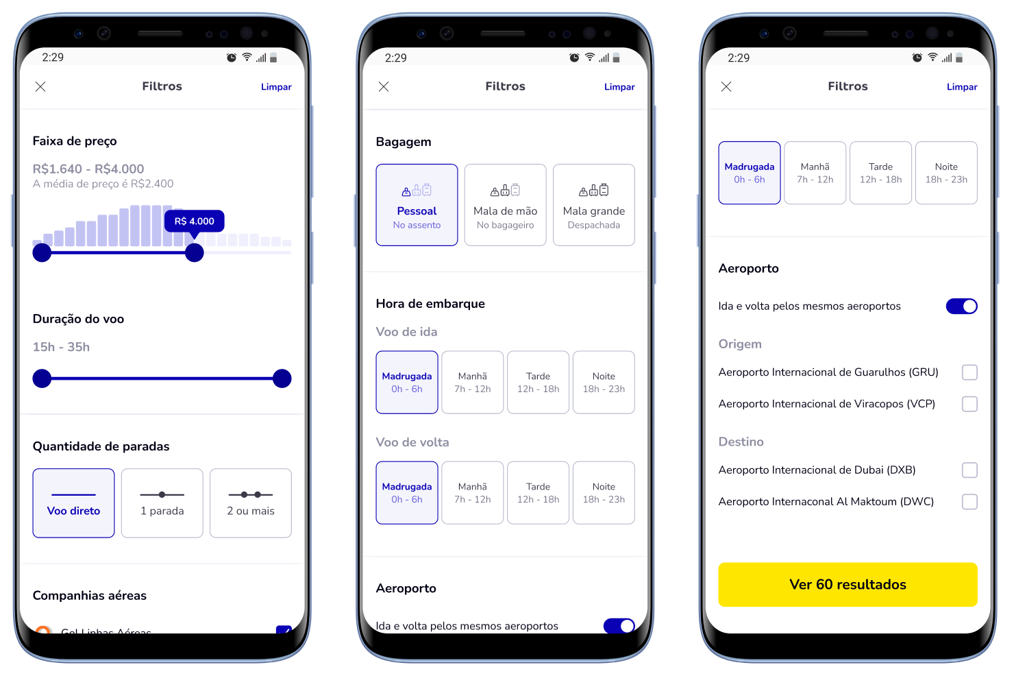
Introduced quick filters for best prices, non-stop flights, and more. Enabled easy modifications for destinations, dates, and seat selections, with added details like wait times and seat availability.
Result Filters
Developed advanced filters based on frequently used options and recent selections, enhancing personalization and ease of finding suitable flights.
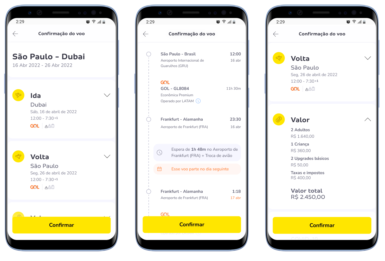
Flight Confirmation
Created a detailed confirmation screen with flight itineraries, pricing breakdowns, and crucial travel information like COVID-19 guidelines, baggage policies, and airport instructions.
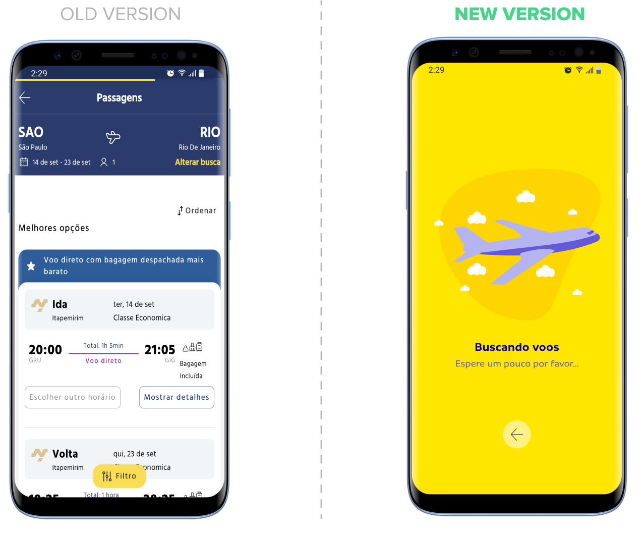
OLD VS NEW VERSION
Loading Results
The old version had 40+ second load times with shifting elements. The new version adds a loading animation and complementary products to keep users engaged.
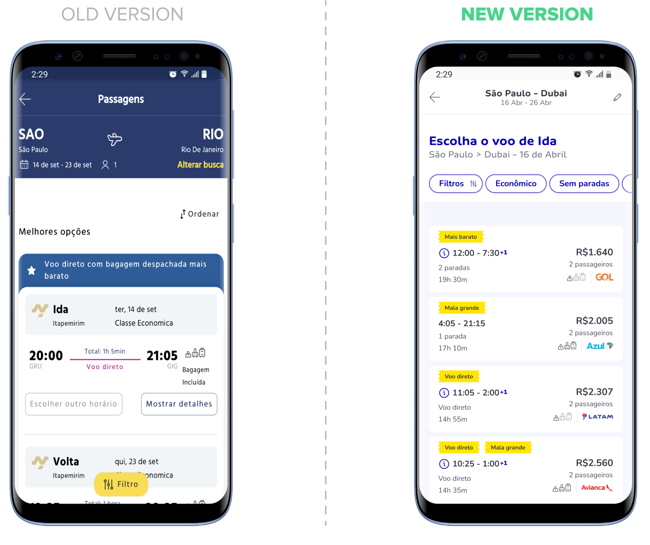
Closed Size
The old version had bulky cards with redundant outbound/return details. The new version shows outbound first, then concise return options, focusing on price, time, baggage, stops, and airline.
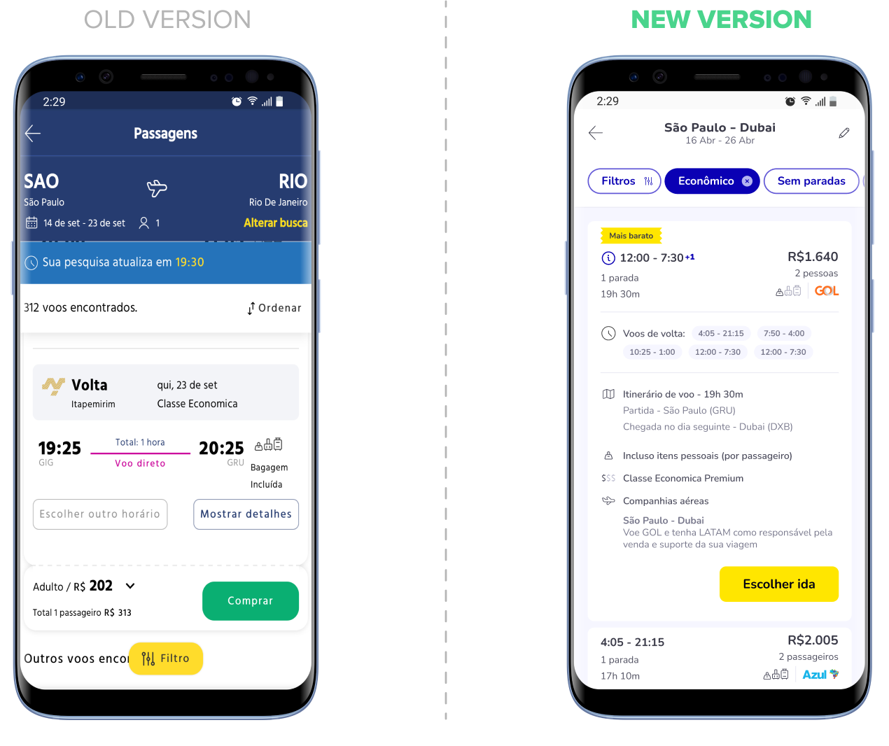
Open Card
In the new version, after clicking in a card, users see details like return flights, itinerary, class, and airline info, supporting a second JBTD.
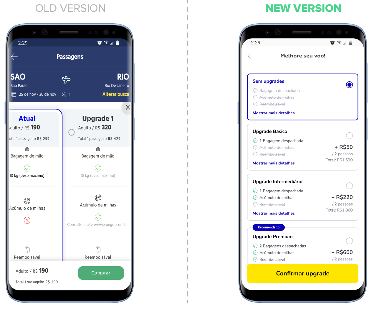
Upselling
The old version had awkward scrolling, making it hard to compare plans and key details. The new version uses a vertical layout, showing all info on one screen with expandable details.
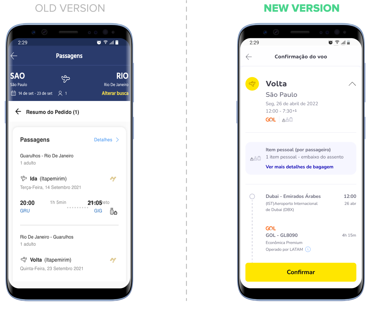
Flight Confirmation
The old version repeated search info with too much scrolling. The new version shows key details upfront, with expandable sections for itinerary, airline info, baggage, and check-in.
RESULTS
This project highlighted the importance of adaptability in design processes, especially when working with cross-functional teams under tight deadlines. By leveraging existing data, conducting focused research, and maintaining clear communication with stakeholders, I delivered a solution that significantly improved both user experience and business outcomes.