
Protected: Usability Improve
INTRODUCTION
Role
- Role: Sr. Product Designer
- Company: Rappi
- Team: B2B • Merchants Onboarding
- Country: Global (9 Countries)
Challenge
High conversion drop-offs in the menu setup and document upload steps due to fragmented experiences, technical inefficiencies, and unclear instructions, delaying merchant activation.
Solution
Led discovery research, defined a new roadmap, and redesigned the onboarding journey by improving document validation, optimizing menu setup, and addressing technical issues, creating a seamless experience.
Impact
- E2E Conversion: Increased by 53.4%.
- Verified Leads: Increased by 135.4%.
- Catalog Completion: Improved by 11.5%.
DISCOVERY
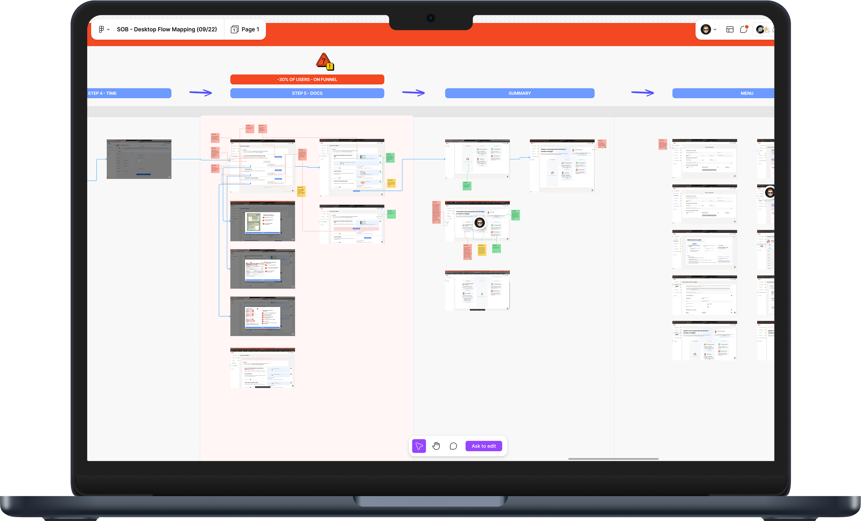
Map problems
I conducted thorough product testing, meticulously mapping each screen to identify issues. I tested both mobile and desktop versions in Spanish and Portuguese for the company’s main markets: Colombia, Mexico, and Brazil.
Impact Level
Workshop
After that, I ran a workshop with the Product Manager to categorize issues into three tiers—low, medium, and high impact—based on user difficulty and experience disruptions. This helped prioritize the most critical usability improvements.
144
Issues to
improve
LOW IMPACT 30%
MEDIUM IMPACT 34%
HIGH IMPACT 37%
Key Issues
Complexmenu setup
Issue: No guidance, bad usability, to much information
Impact: High abandonment rate at this step.
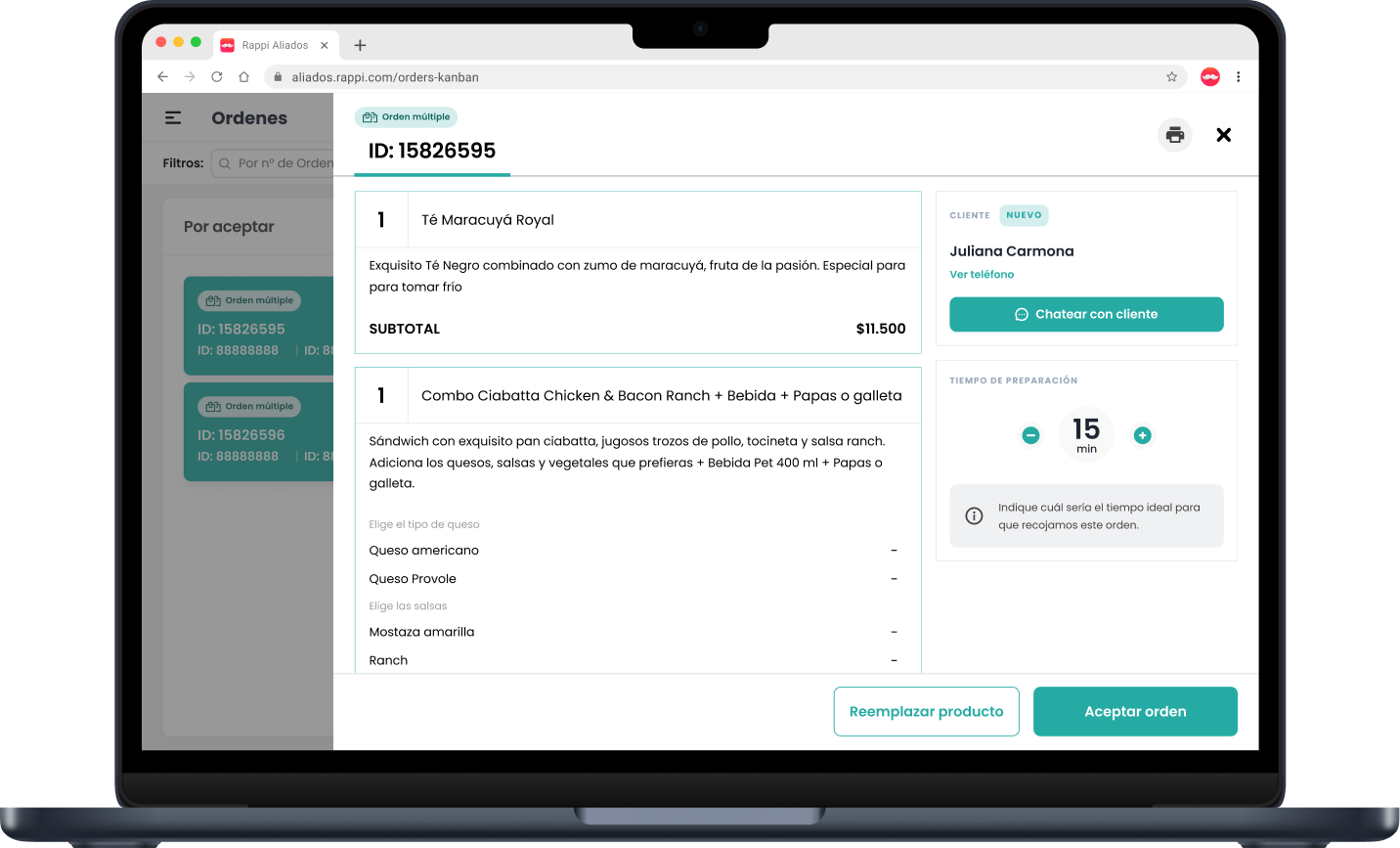
Documentsupload issues
Issue: Almost no extensions or file sizes accepted
Impact: High conversion loss at this step.
Bad usabilityon navigation E2E
Issue: Duplicated buttons, positioned at the top, others.
Impact: High conv. loss, much time spent on steps.
High quantityof information
Issue: High cognitive load, much scroll on mobile
Impact: Increase the number of days for finish the process
WHERE
In High
Impact
55 ISSUES
33 TECHNICAL ISSUES
60% FROM HIGH IMPACT
22 DESIGN ISSUES
40% FROM HIGH IMPACT
DEFINITION
After the discovery phase, I identified an opportunity to deliver value much faster than the initial plan. Before I joined, the team intended to start with a full redesign. However, my research revealed that solving key issues first would have a more immediate impact, addressing critical problems before committing to a full overhaul. I presented this approach to the PM and stakeholders, emphasizing the importance of understanding and fixing the real pain points first. The strategy was well received and adopted.
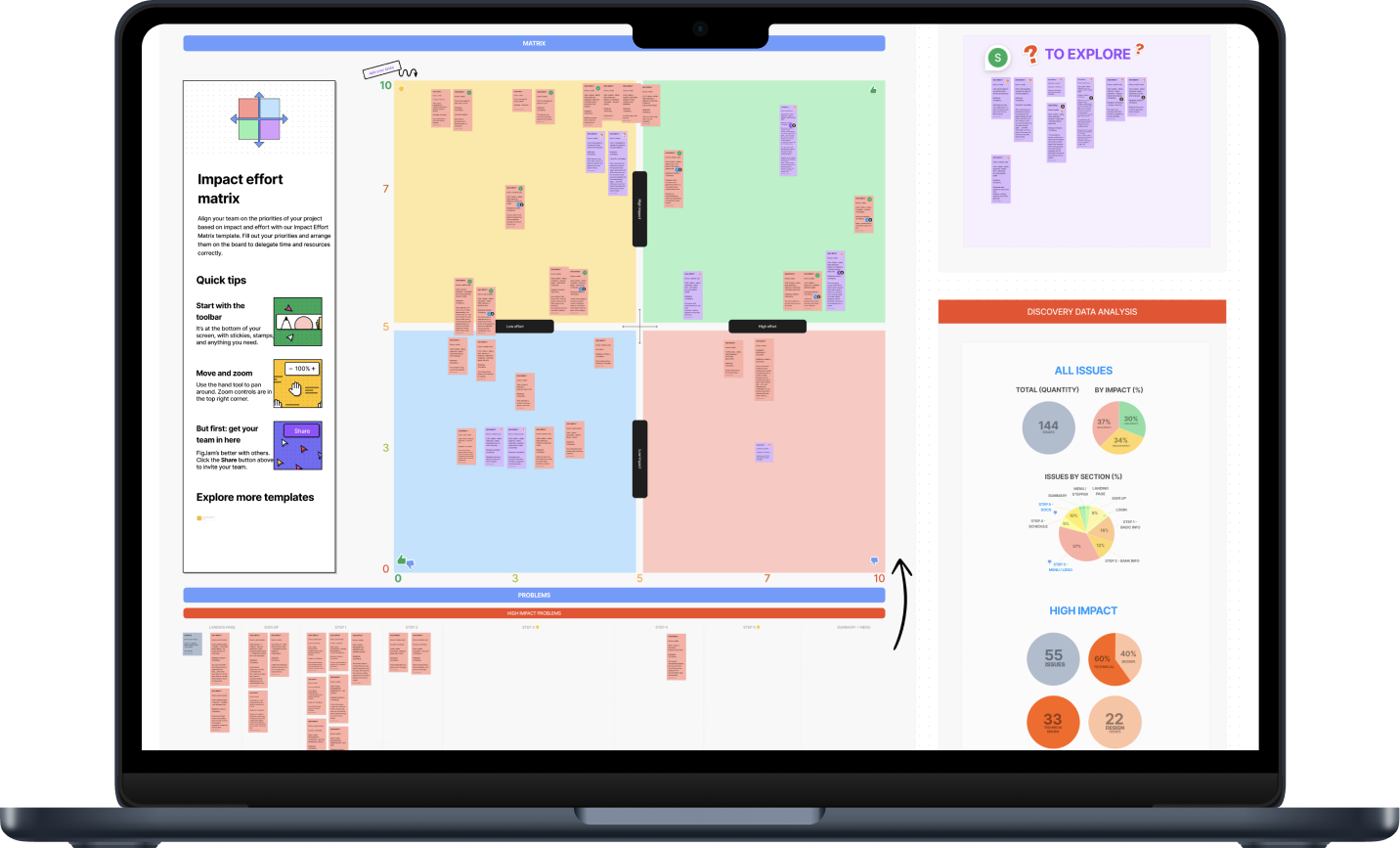
Prioritization
So I conducted a workshop with the Product and Tech teams, during which we began creating an Impact vs Effort Matrix to prioritize the primary issues and outline our roadmap.
Initially, our focus was on tackling high-impact problems, given the sheer quantity of issues we identified: 144.
New Roadmap
The PM and I defined a new roadmap with three releases:
- Pack 1: Bug fixes, focusing on menu and documentation.
- Pack 2 & 3: Discovery and redesign to enhance the end-to-end experience.
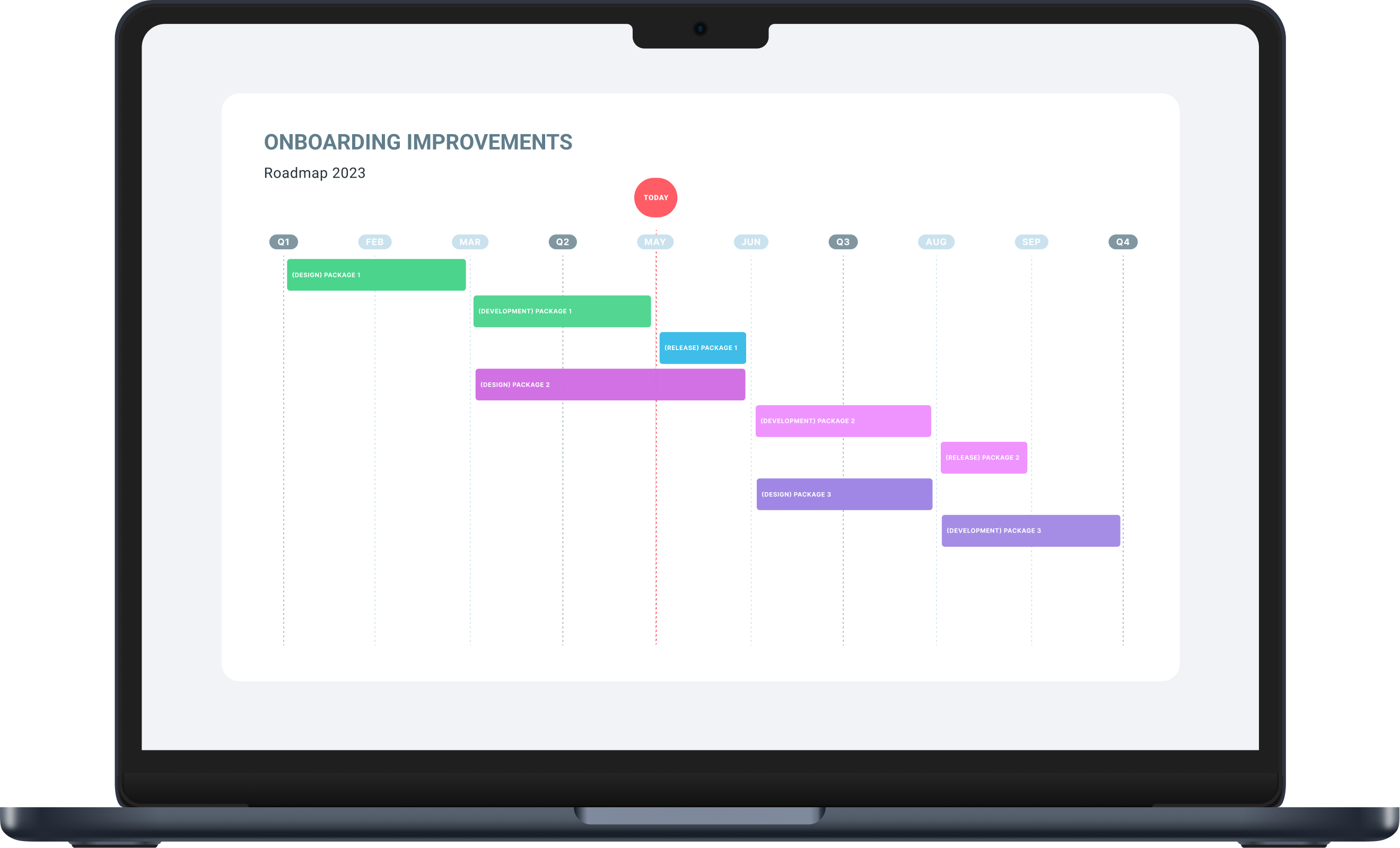
Package 1
Fix bug issues
Steps: Menu + DOCs
Package 2
Discovery + Redesign
Steps: E2E Experience
Package 3
Redesign only
Steps: E2E Experience
PACK 1
SOLUTION
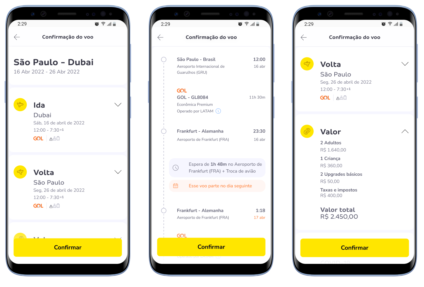
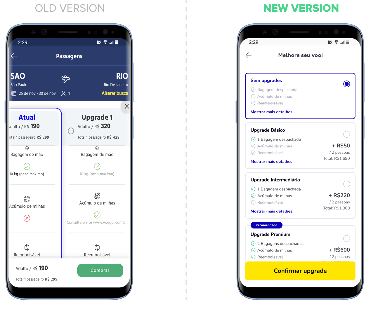
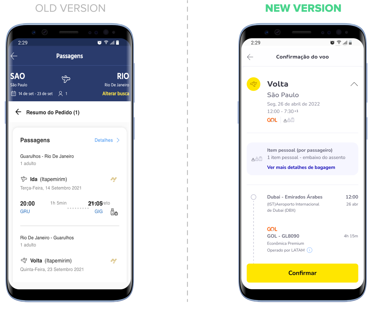
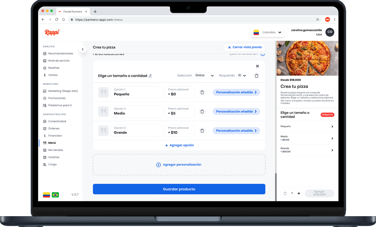
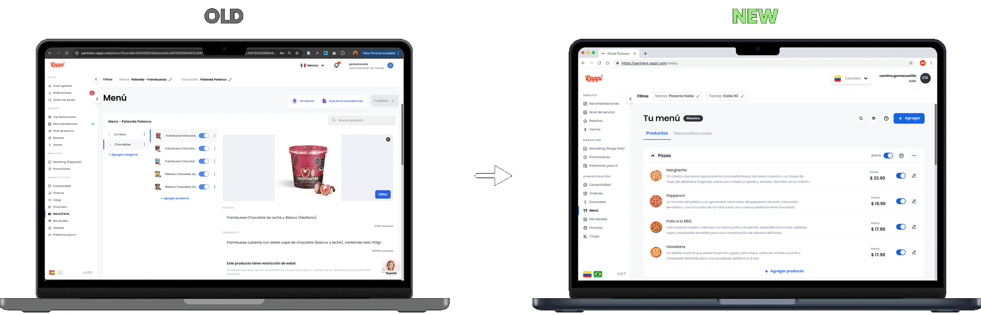
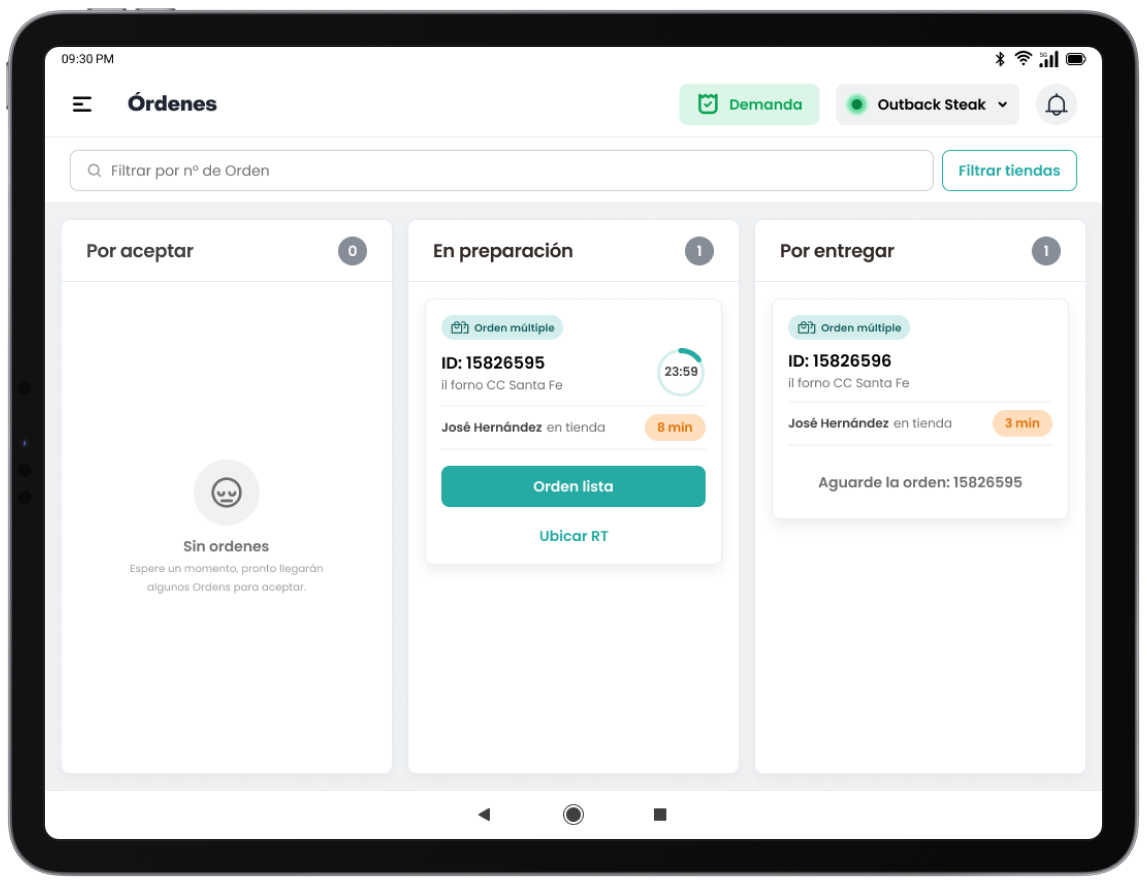
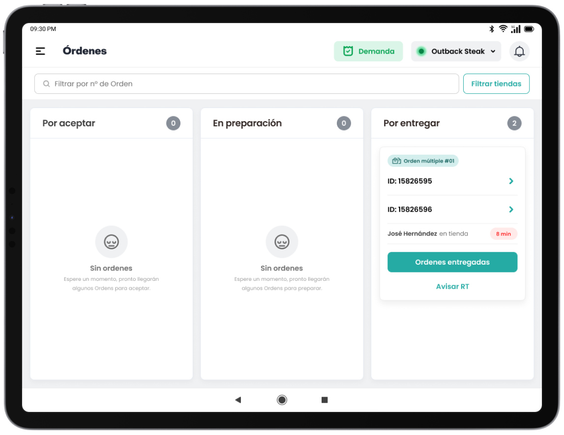
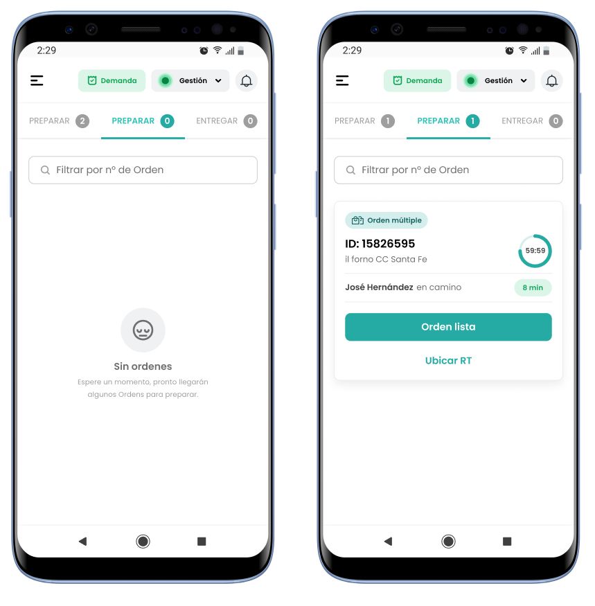
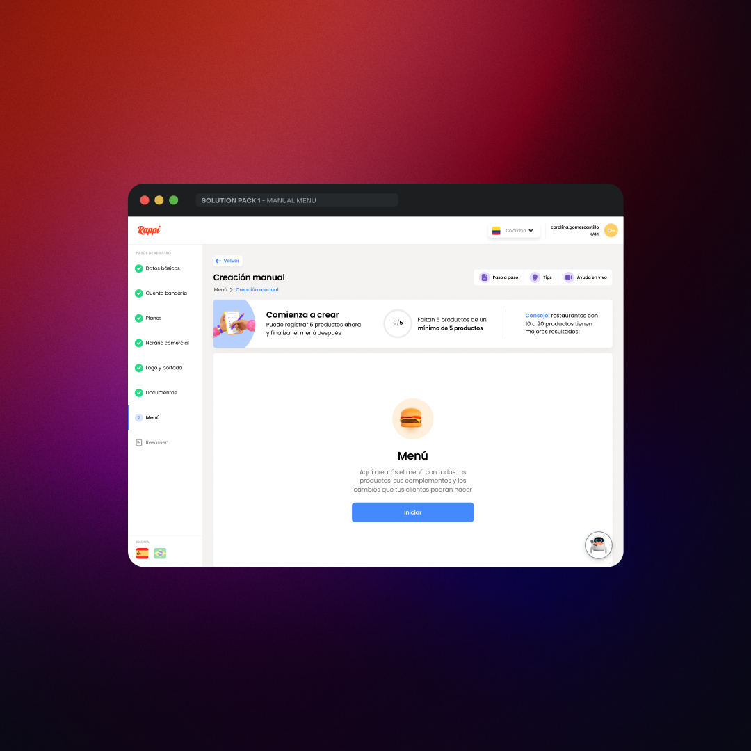
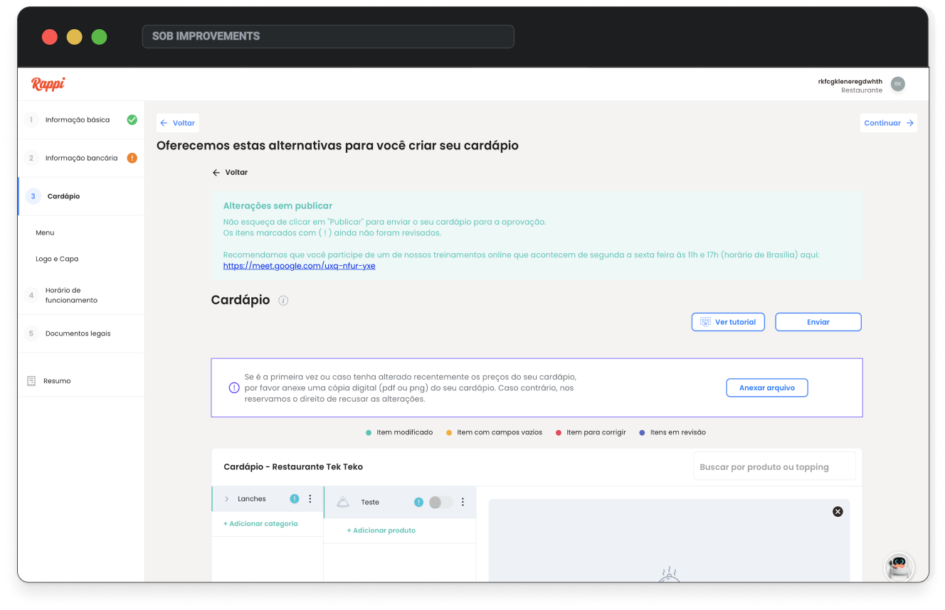
In the first release, our main focus was on improving the menu experience, which had the most friction. I simplified navigation, removed blockers, and ensured the stepper was always visible so users knew where they were. We also made small improvements to the documentation and tackled technical bugs that didn’t require major design changes. With 50% of users on mobile, we prioritized mobile usability, streamlined key flows, and aligned the experience with market standards.
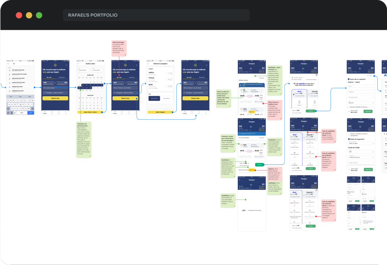
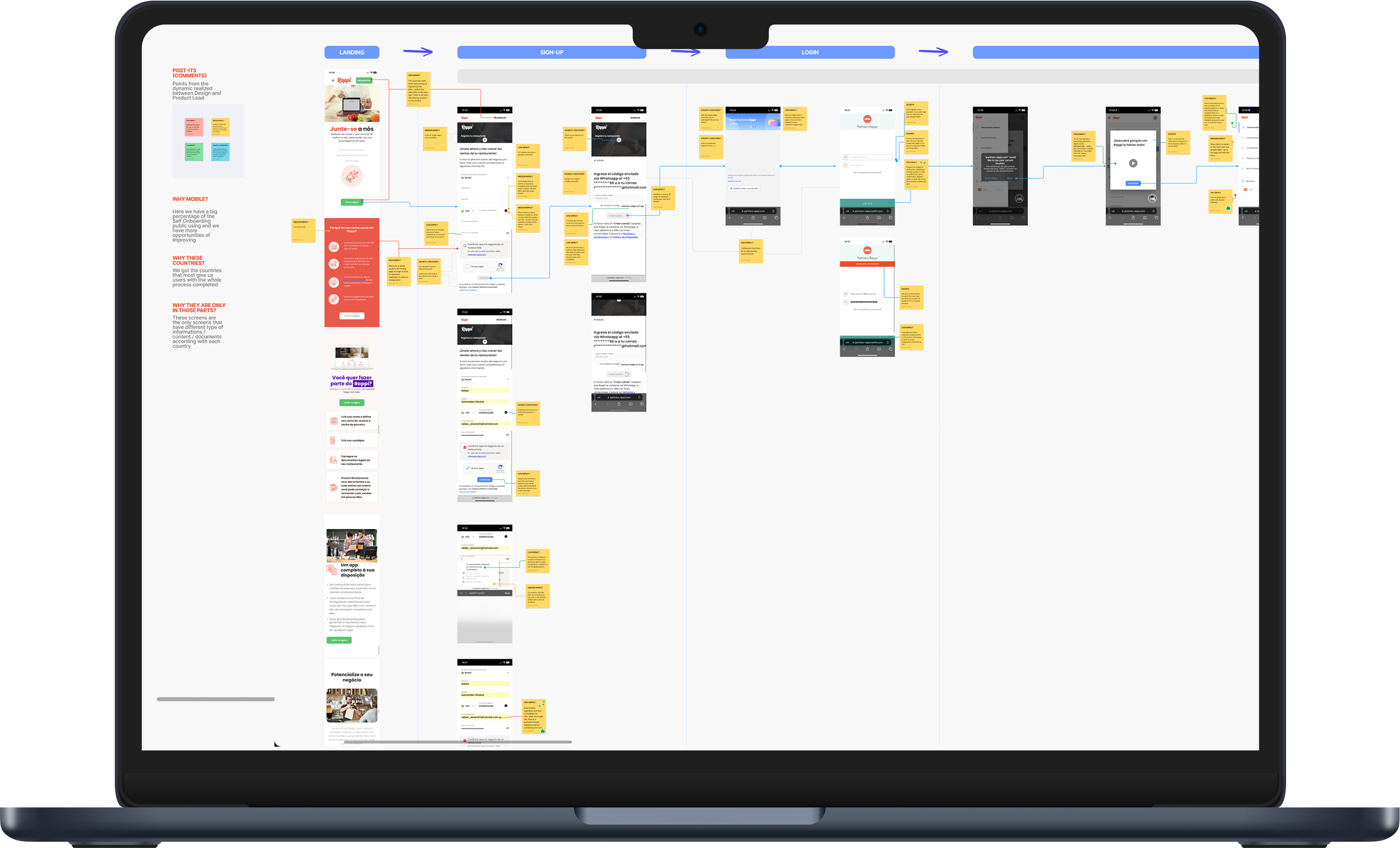
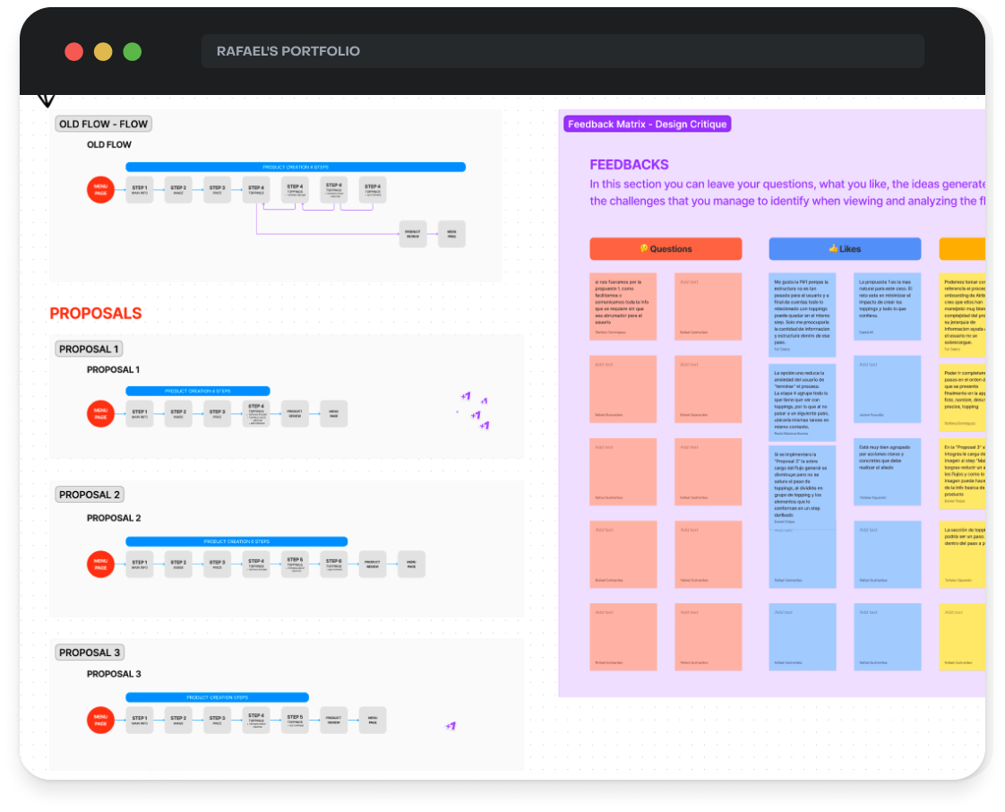
User flow and Design Critique
I analyzed the existing flow, which was overly complex, lengthy, and lacked structure, to find a simpler, more intuitive solution. Before finalizing corrections, I brought this to a Design Critique, where the team collaborated to refine and select the most efficient flow.
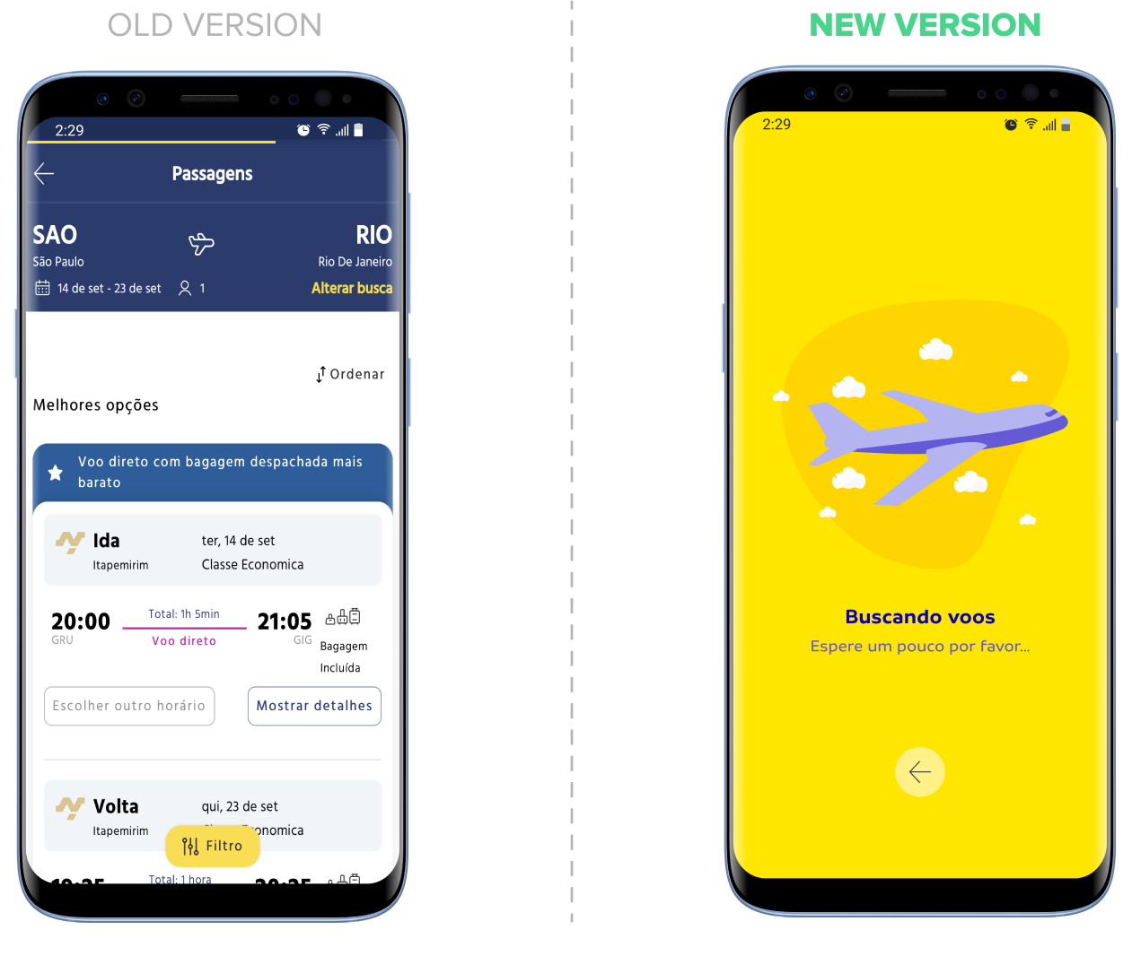
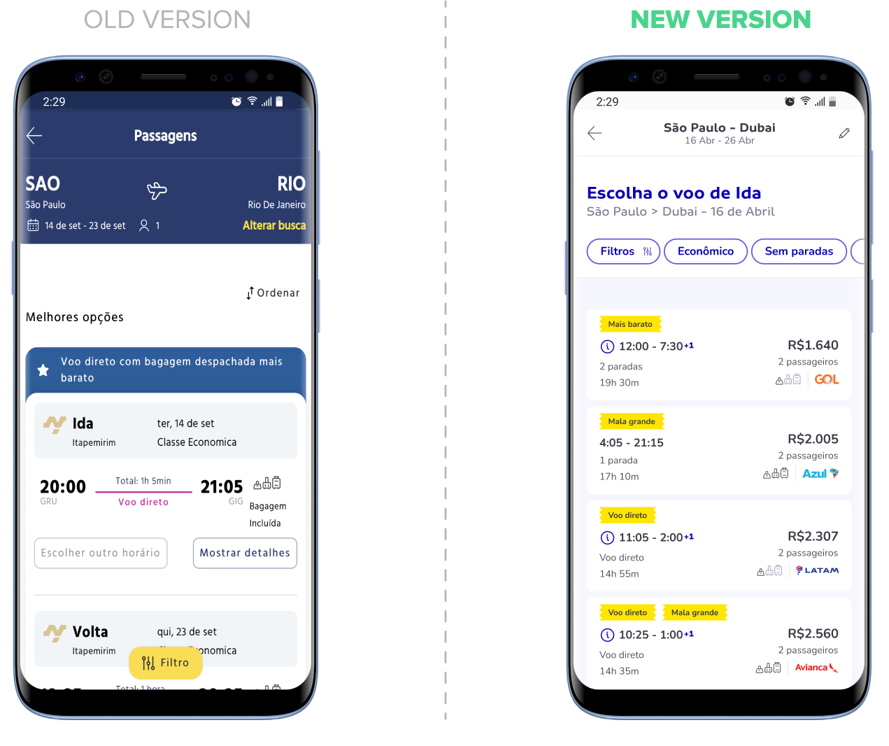
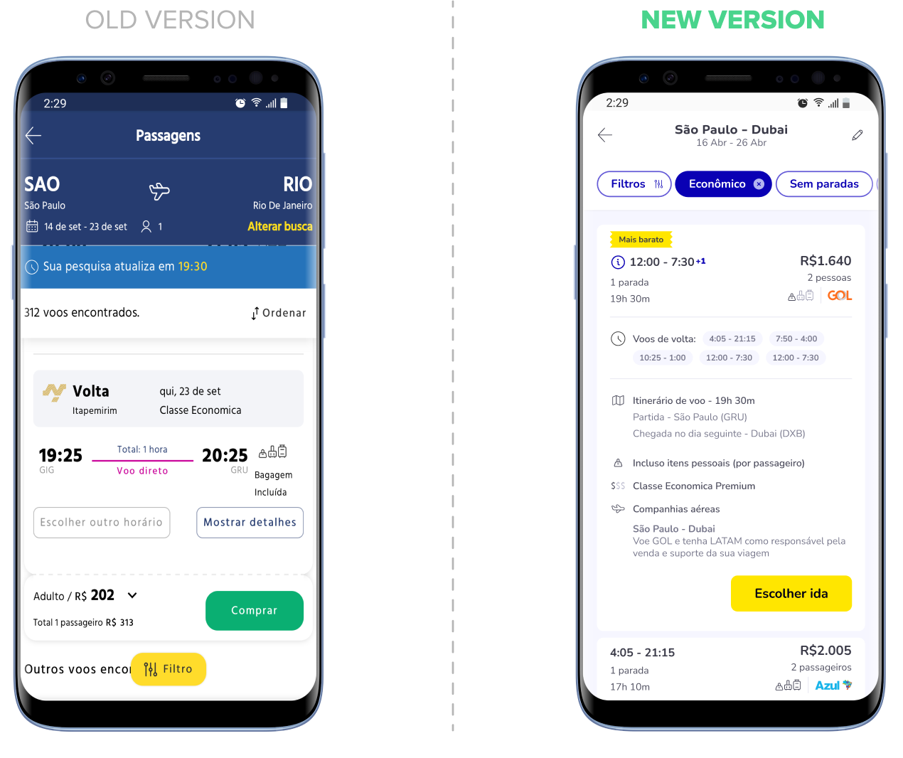
MVP SOLUTION
Desktop version
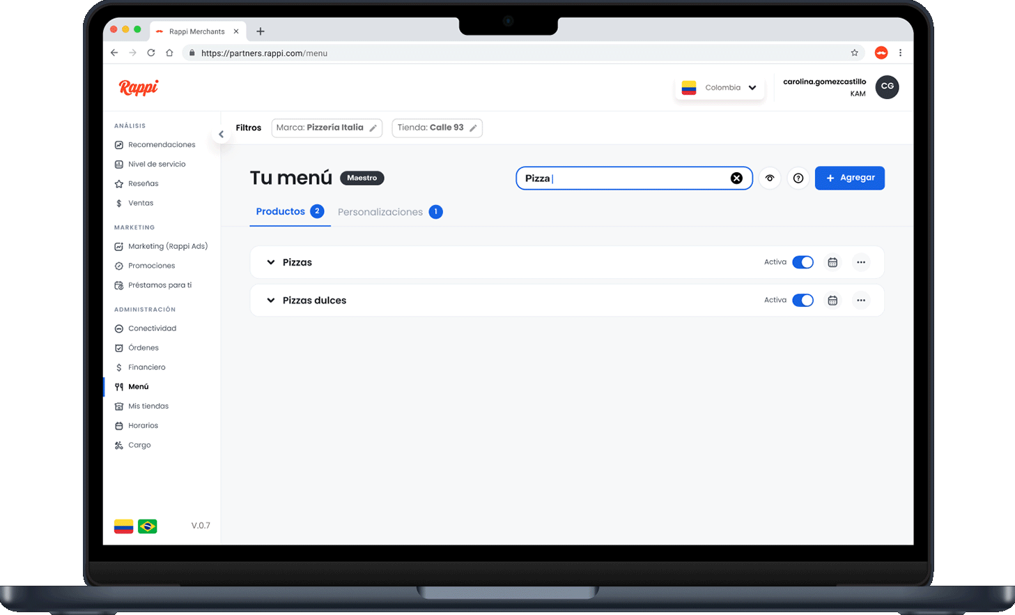
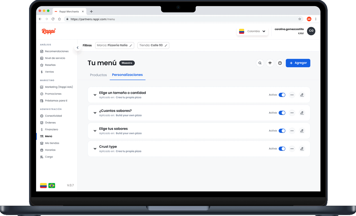
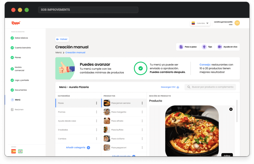
I focused on usability improvements—reducing visual clutter, compacting excess information into support buttons, and refining the side stepper to clearly show each step. I also simplified the menu by removing unnecessary icons and confusing details, making the experience more intuitive.
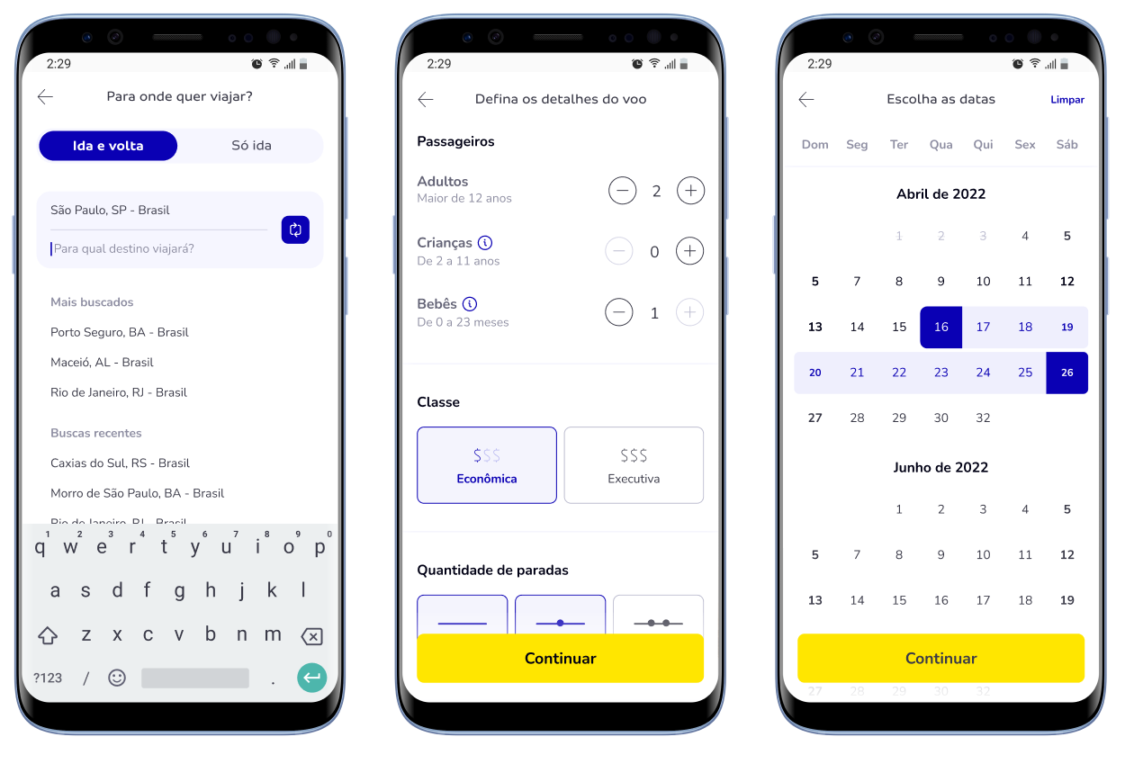
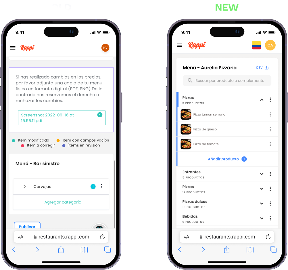
Mobile version
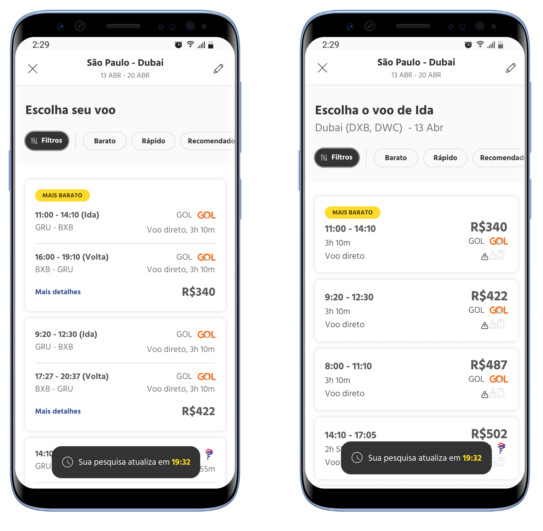
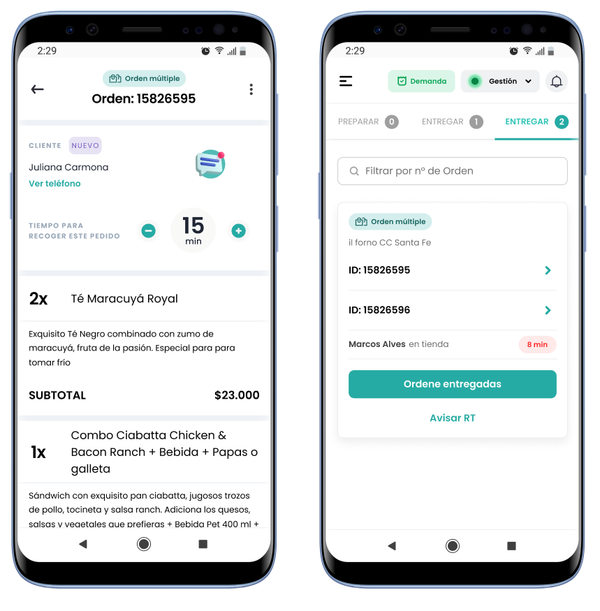
With over 50% of users on mobile, I focused on simplifying the experience and removing unnecessary information. The new design reduces clutter, merges steps into a single guided flow, and reveals only what’s needed. Users can now navigate, edit, and submit their catalog with ease—without backtracking or facing overwhelming content on smaller screens.
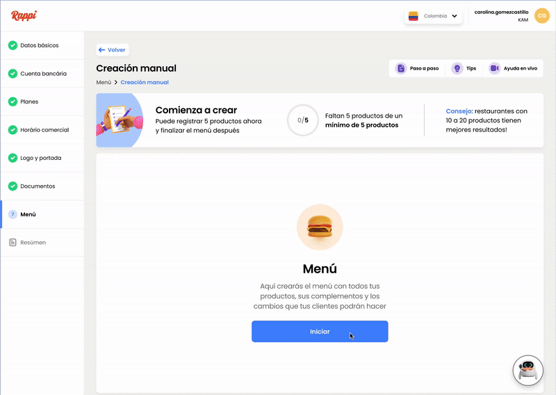
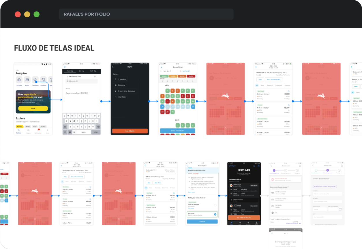
Prototype
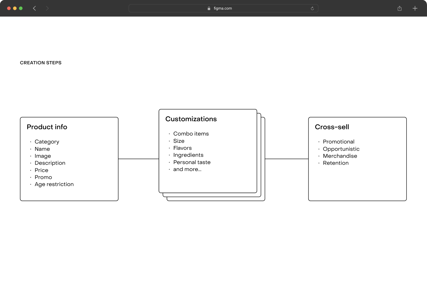
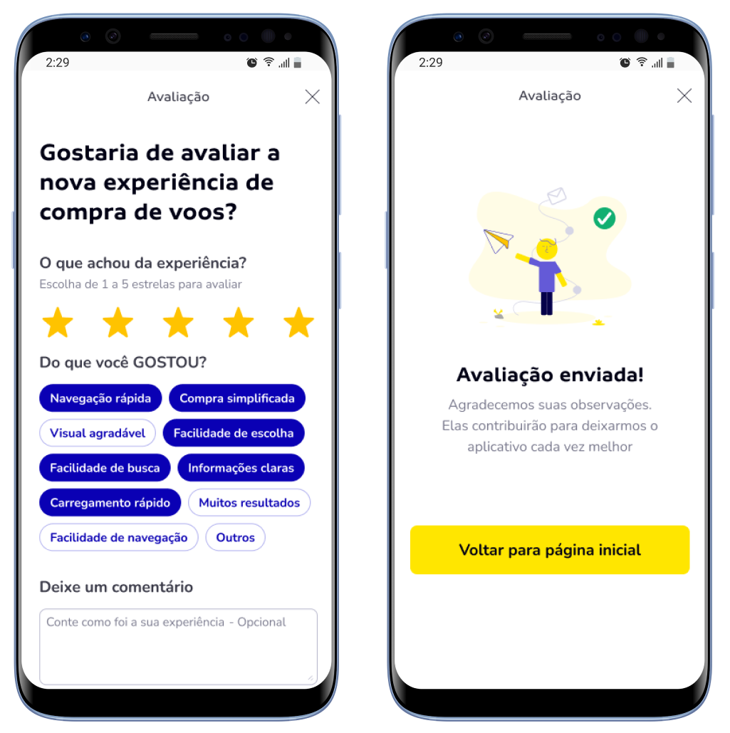
I developed a prototype to validate the final solution with users, focusing on the most challenging part of the flow—creating a product with toppings. We refined this step to enhance user understanding. After completing this process, users needed to submit the menu for approval. The GIF on the side demonstrates the steps in action.
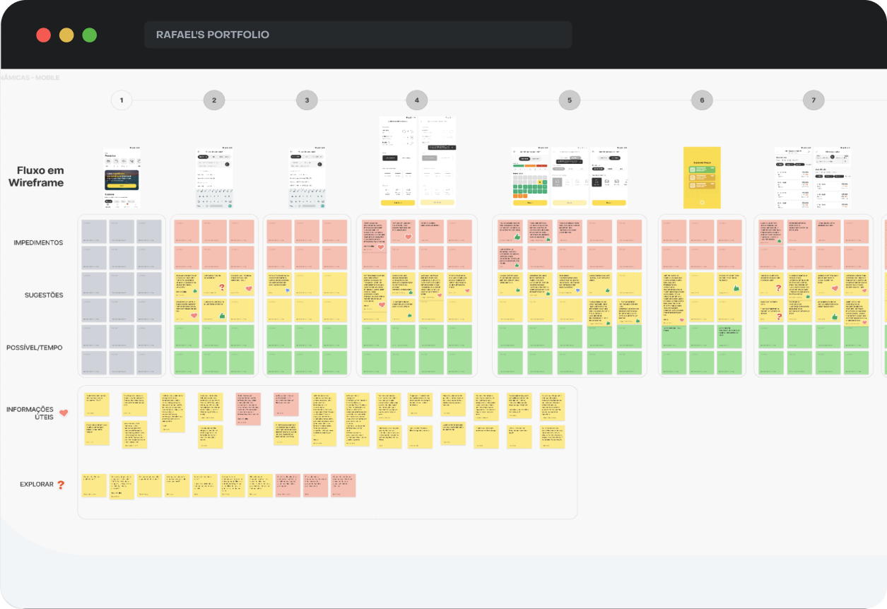
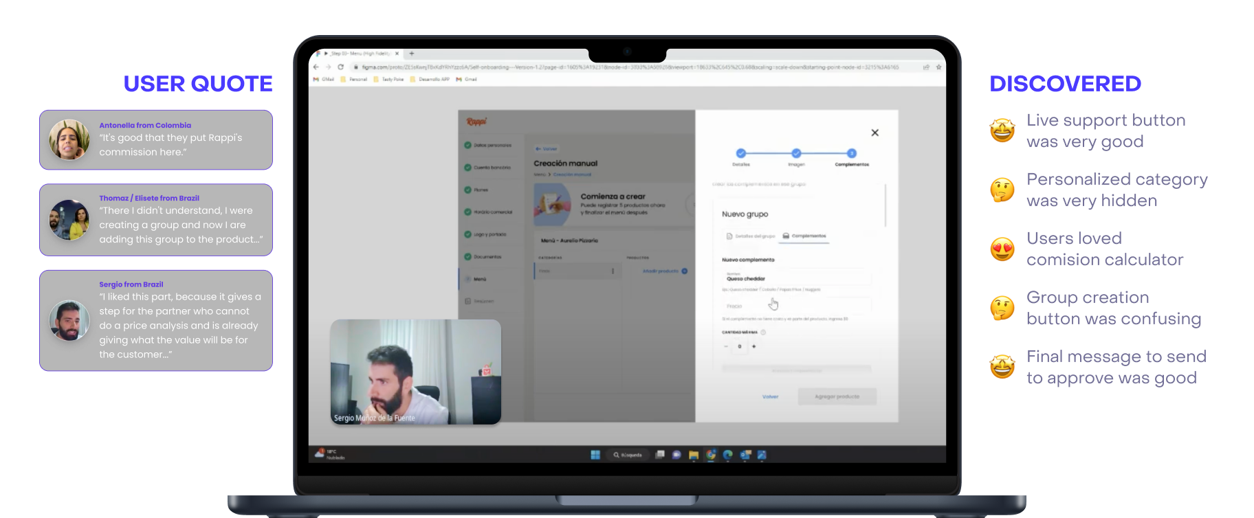
USABILITY TEST
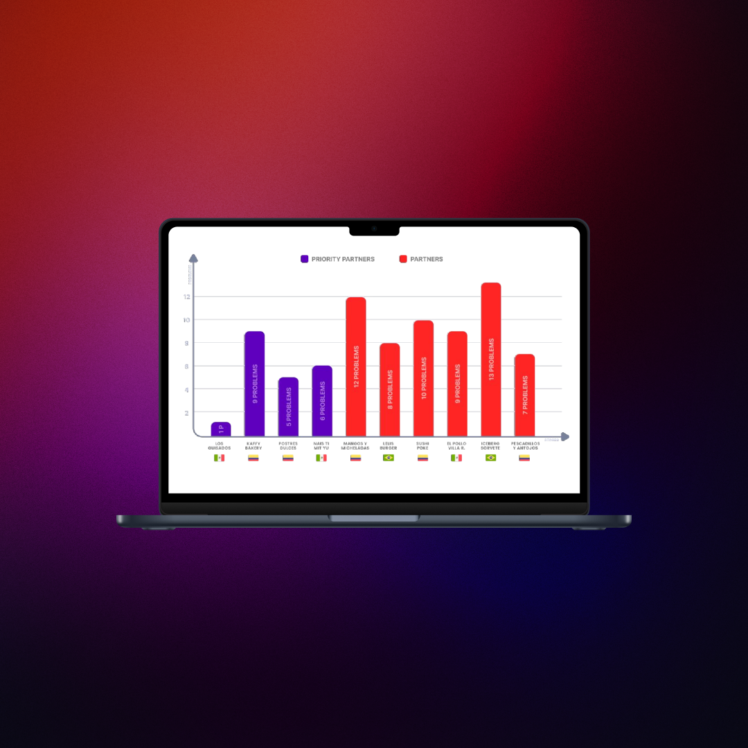
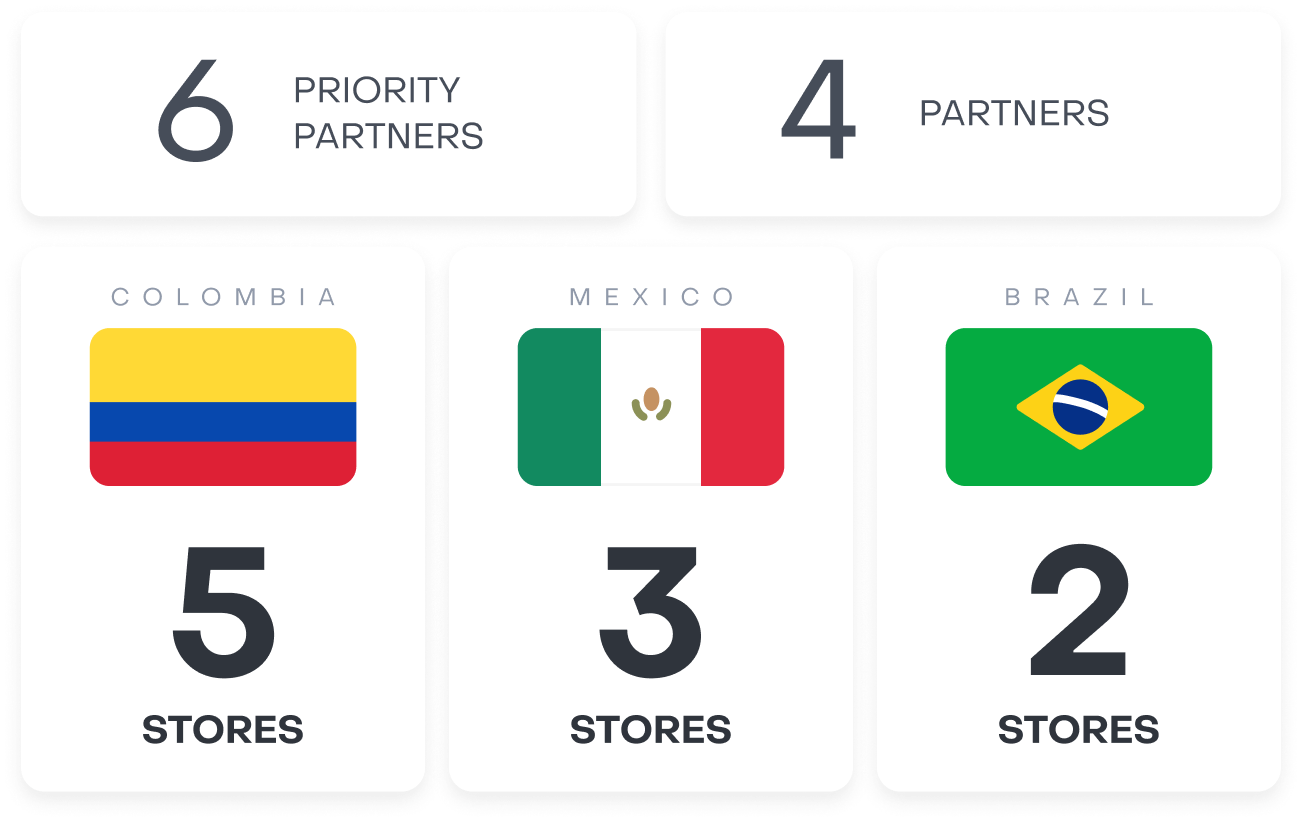
To ensure the effectiveness of our enhancements, we conducted a comprehensive usability test involving Brazilian and Spanish-speaking restaurants. We engaged with 5 users from Brazil, Colombia, and Mexico to gauge the performance of our redesigned manual menu experience in each respective country.
Through this testing phase, we identified several areas for improvement, such as refining the grouping of complements and rebranding “toppings” to “complements,” among other critical points.
RESULTS
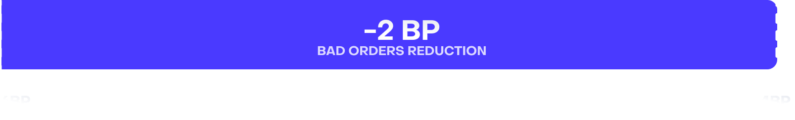
Delivering Pack 1, we exceeded menu conversion targets and neared our end-to-end goal. While the project evolved into new initiatives, it stands as a key reference, showcasing my process and impact in solving complex challenges.
PACK 2 & 3
DISCOVERY
Before redesigning Pack 2 and 3, I conducted a discovery phase to identify key pain points restaurants faced and gather insights from internal teams. To align on challenges and validate our hypotheses, I organized a workshop with cross-functional teams. This helped us refine our understanding before moving forward with user validation.
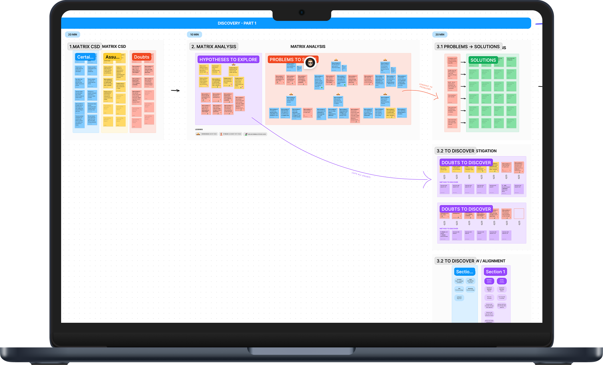
Internal Workshop
Before talking to users, I gathered existing knowledge from internal teams who had been dealing with these challenges firsthand. I organized a workshop with key stakeholders to validate hypotheses, align on pain points, and uncover half of the challenges before moving to user validation.
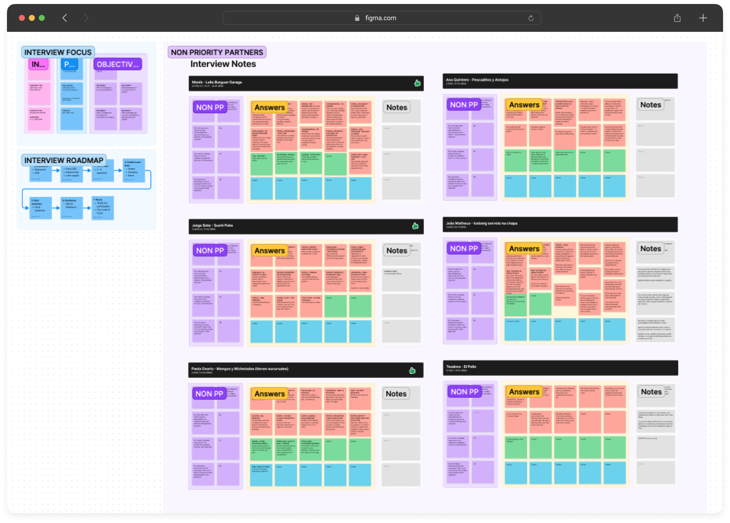
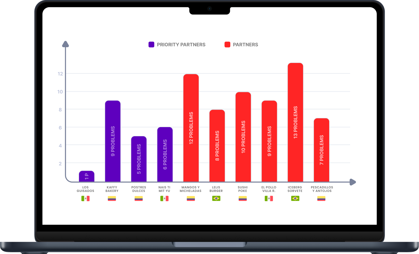
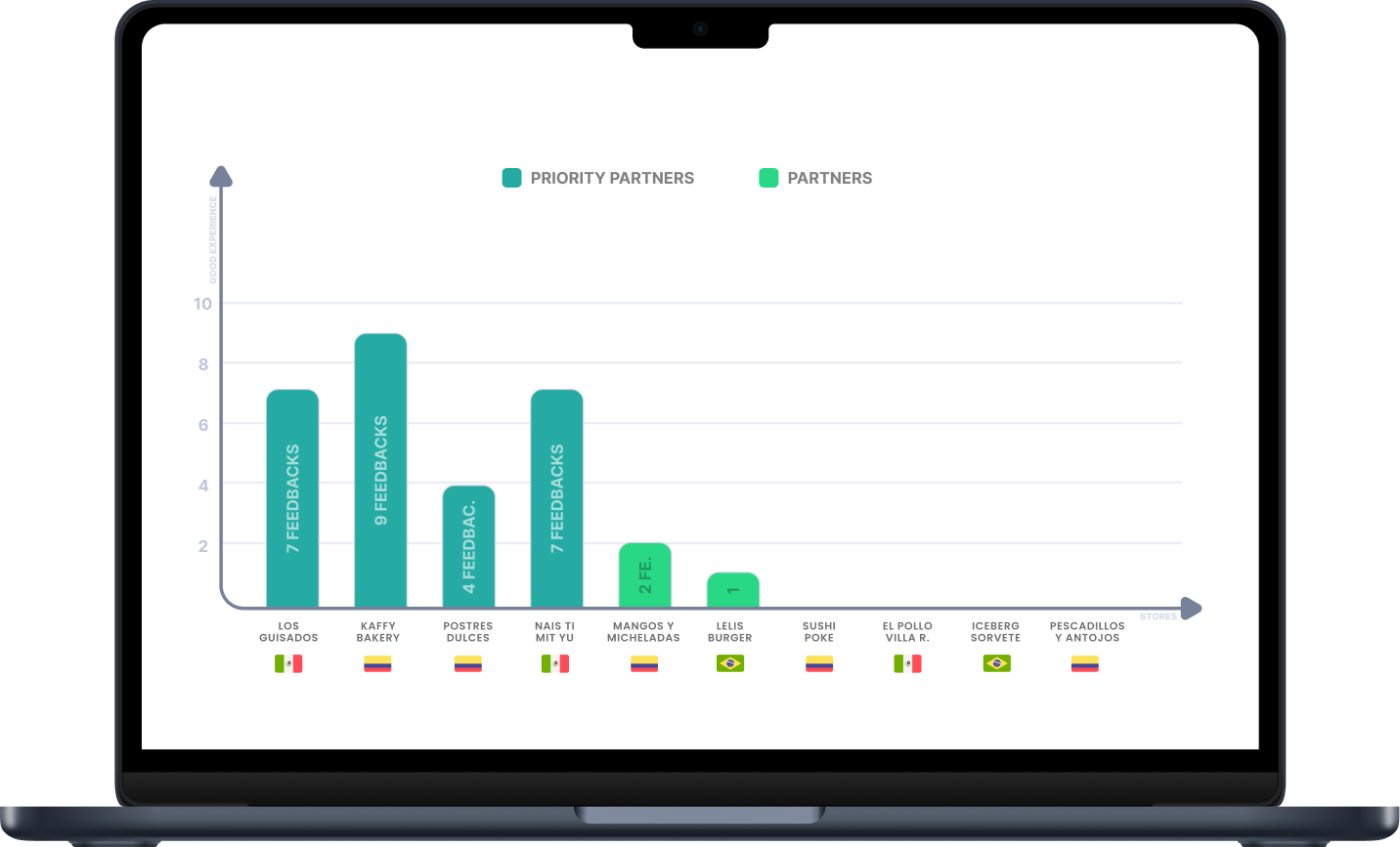
User Interview
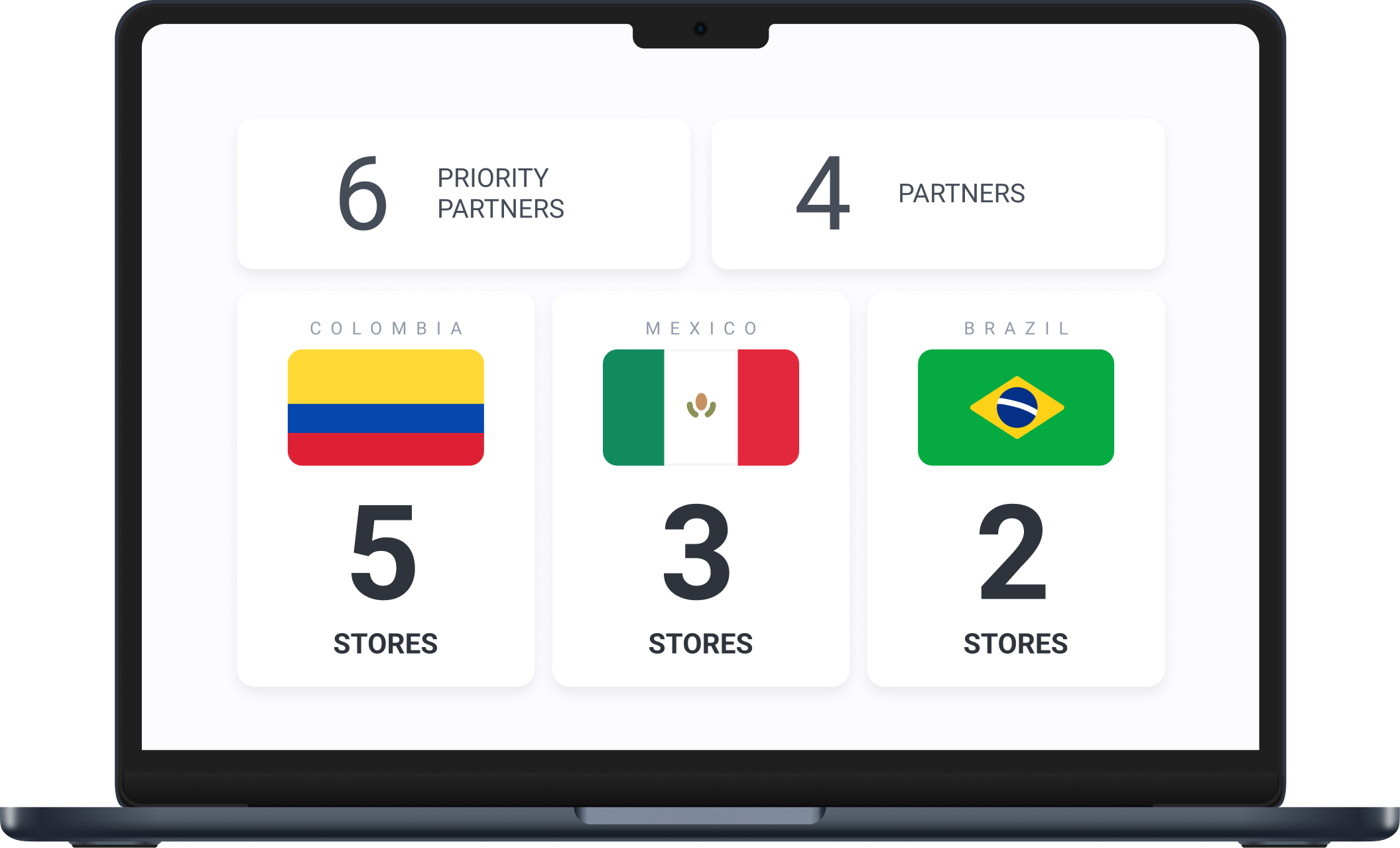
I recruited 10 restaurants from key countries, selecting businesses with different outcomes—successful, recently onboarded, and struggling with sales—to compare their experiences and identify onboarding challenges. This qualitative research helped uncover key insights, and I provided participants with prizes for their restaurants as a thank-you.
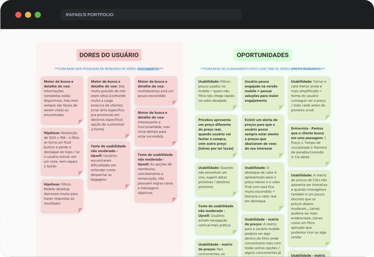
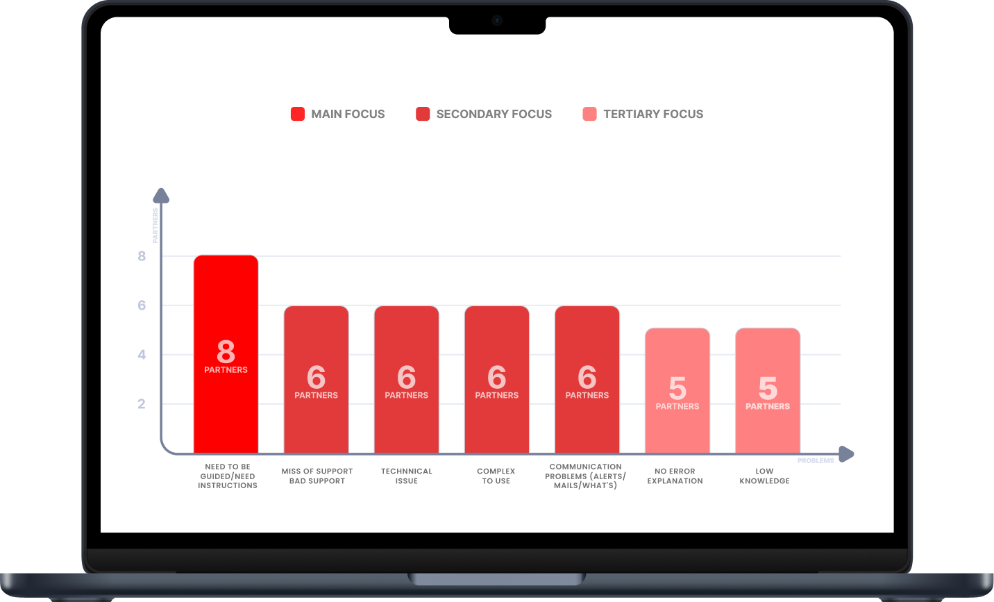
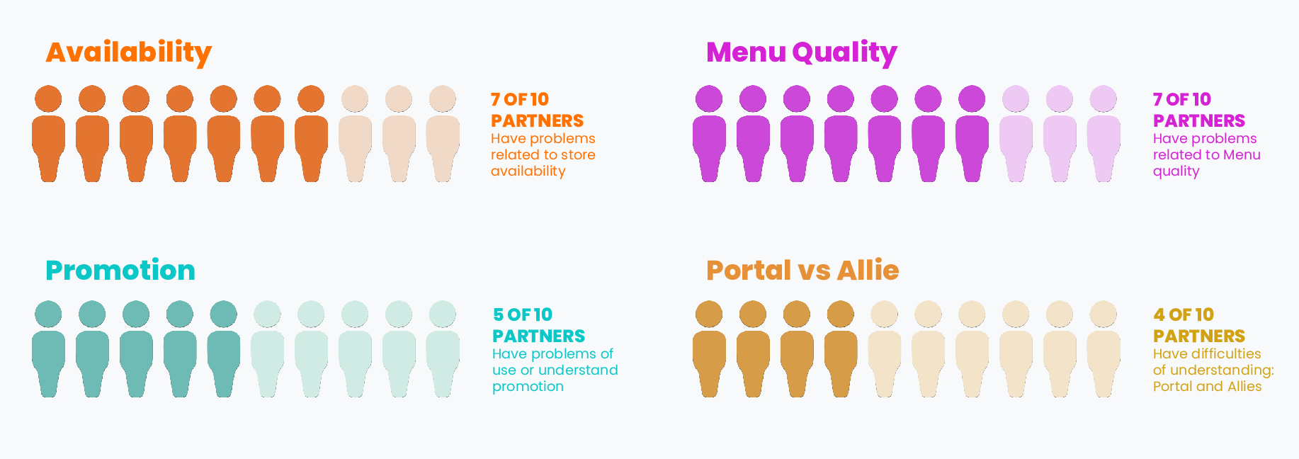
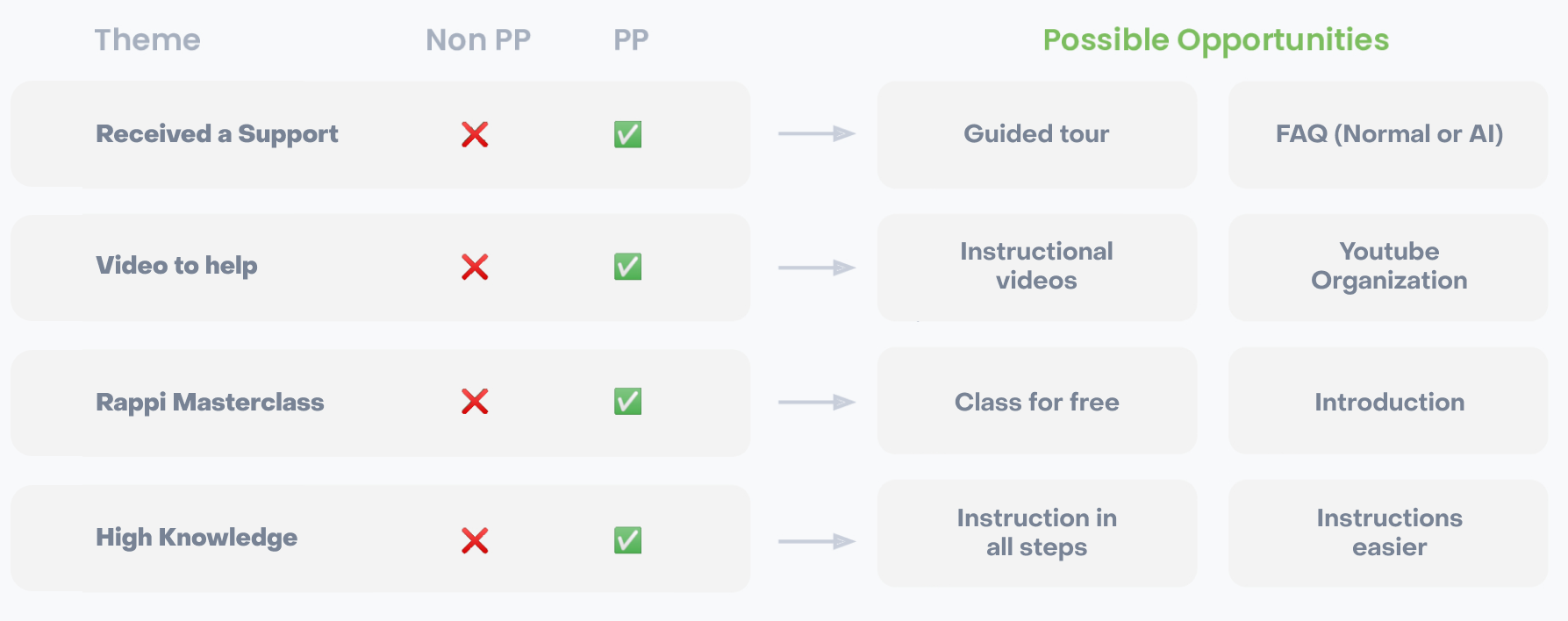
Opportunities
Create aguided process
Issue: Users get lost about what path is better for them
Impact: Reduce E2E conversion, mainly on menu.
Simplifyinstructions
Issue: Many instructions, much info, users didn’t look
Impact: Lack of information on what is relevant to users
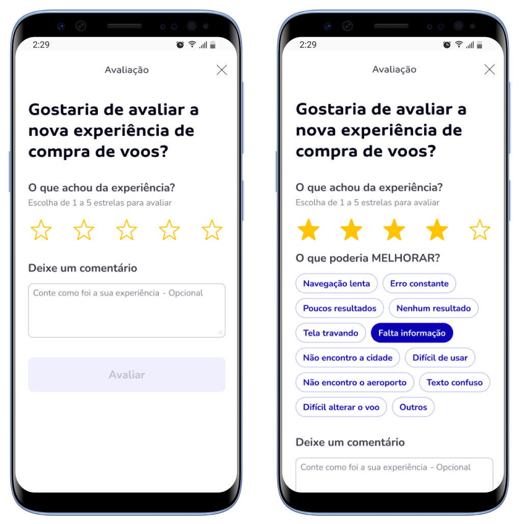
Create error feedbacks
Issue: On errors, users have no detail or how to solve it
Impact: High conv. loss on specific steps like DOCs.
Instructionfor all steps
Issue: Some steps literally have no information
Impact: Some users get lost on basic steps: bank account
DEFINITION
Based on both the first and this discovery, I used all insights to redesign this final experience. The initial discovery focused on technical and usability issues — especially everything we couldn’t fix during the MVP. These were mostly low to mid-complexity problems. Later, we ran internal workshops and user interviews to dive deeper into pains and expectations. By combining all this, we were able to address both packages 2 and 3 more efficiently and strategically during the redesign process.
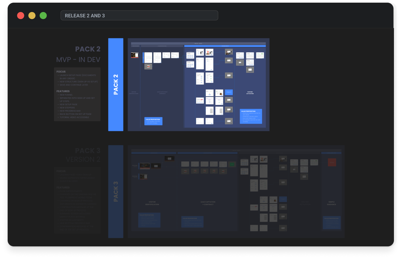
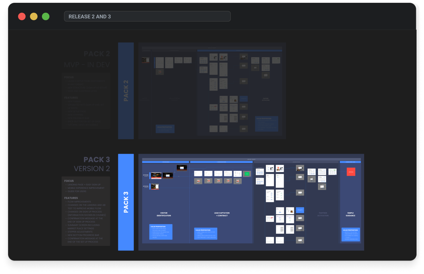
Package 2
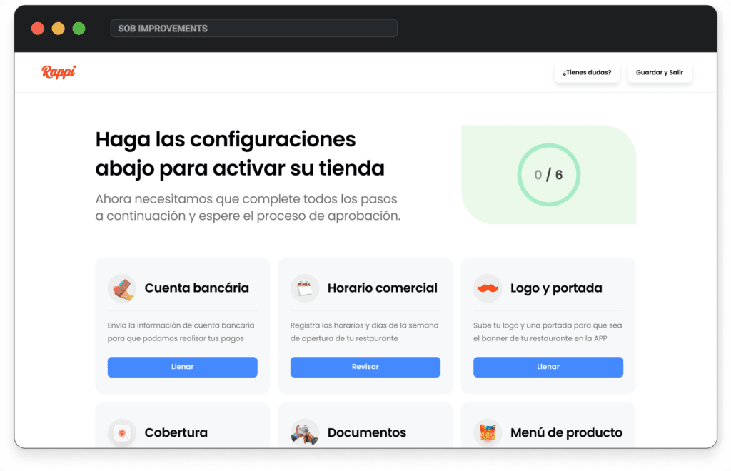
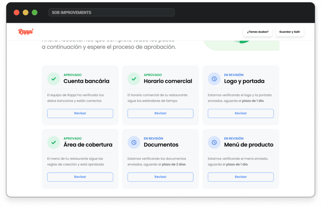
We replaced the rigid, linear onboarding with a flexible flow where users could fill in the information they had—like catalog, hours, or logo—in any order. They could save progress and return later, adapting the process to their reality. Sign-up and setup were separated, and a tutorial video was added to guide users.
Package 3
We redesigned the sign-up to be faster, mobile-friendly, and focused on collecting only essential info all users had. This reduced cognitive load and allowed us to generate high-quality leads in just minutes. The landing page and onboarding flow were simplified to help users start selling more quickly and confidently.
SOLUTION
For the redesign, I focused on solving user pain points and meeting business goals. We simplified the process with a more valuable sign-up—going beyond basic contact info—and allowed users to complete onboarding in their own order, with the option to save and finish later.
To guide users after onboarding, we introduced a clear intro explaining what platforms they’ll use, in what order, and for what purpose—since one setup often depends on another.
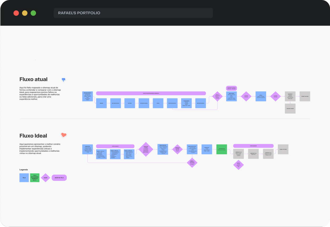
The before-and-after comparisons below were captured on different resolutions—so while there’s a visible size difference, the focus is on the visual structure and feature improvements, not resolution.
DESKTOP VERSION
Landing page
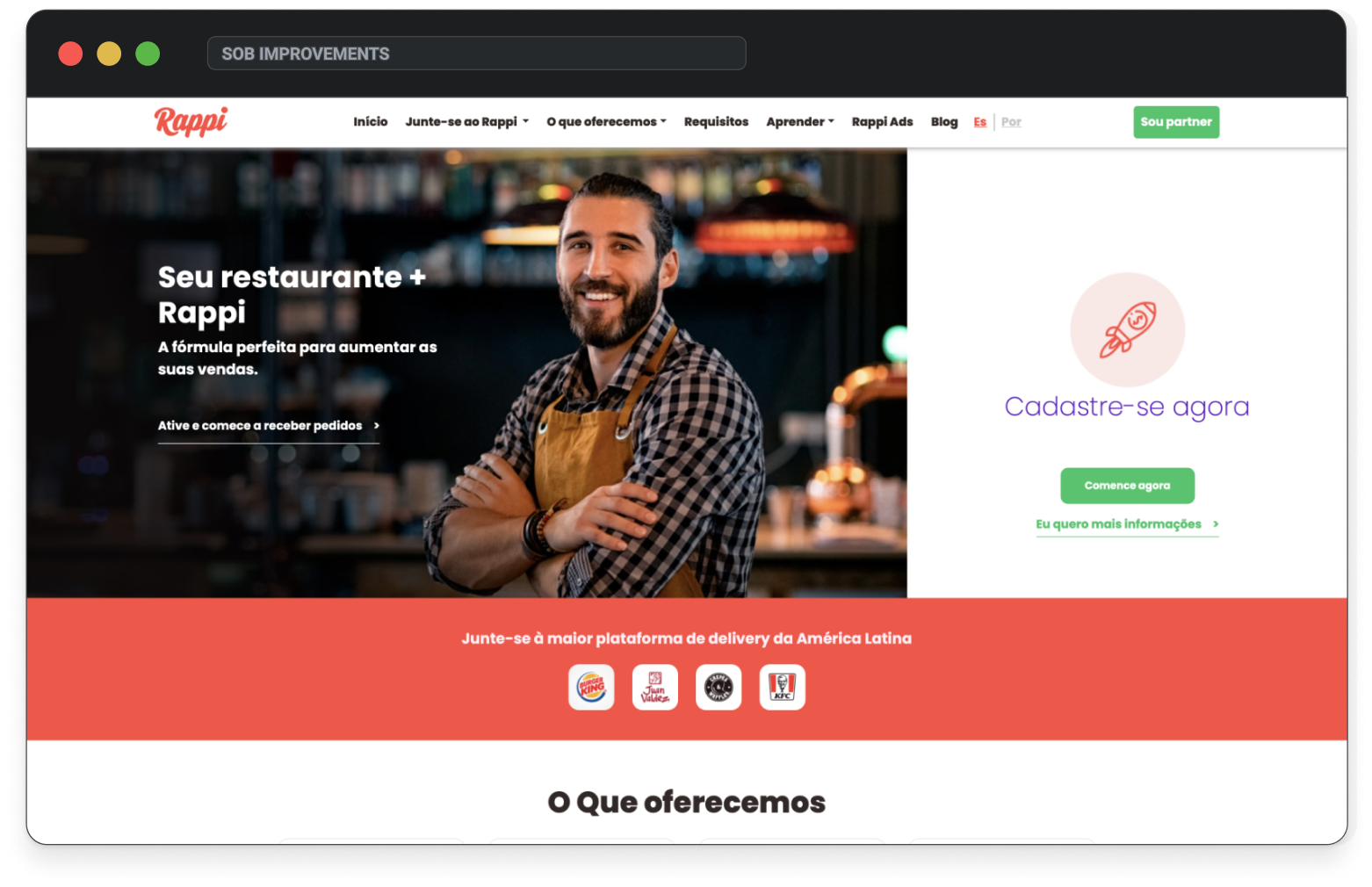
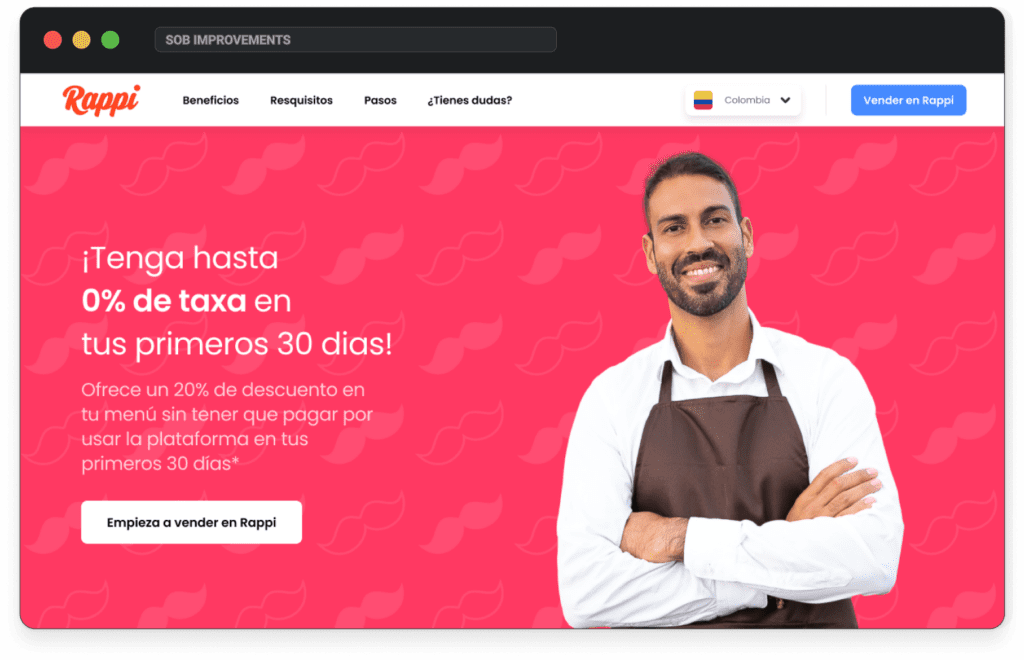
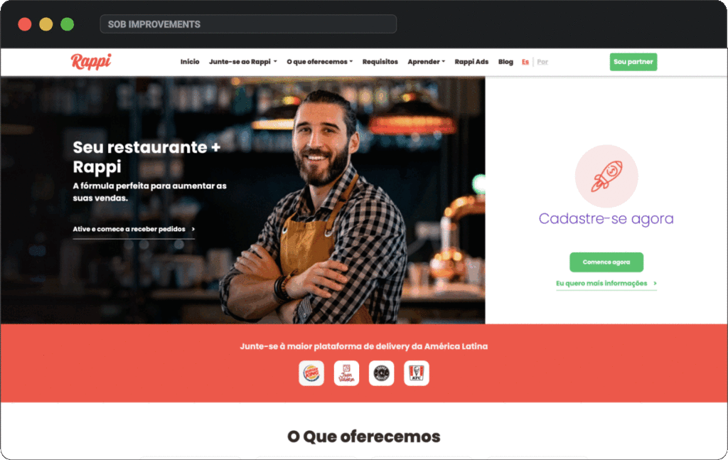
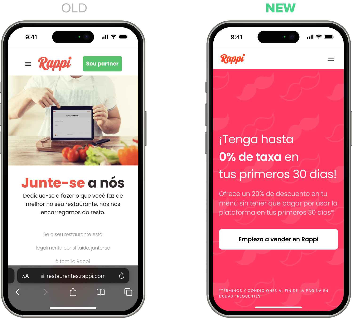
I redesigned the onboarding landing page by focusing only on what truly matters to new users. Instead of overwhelming them with 60+ unnecessary pages about Rappi, I implemented a clean and effective UI that highlights the essential information to drive conversion.
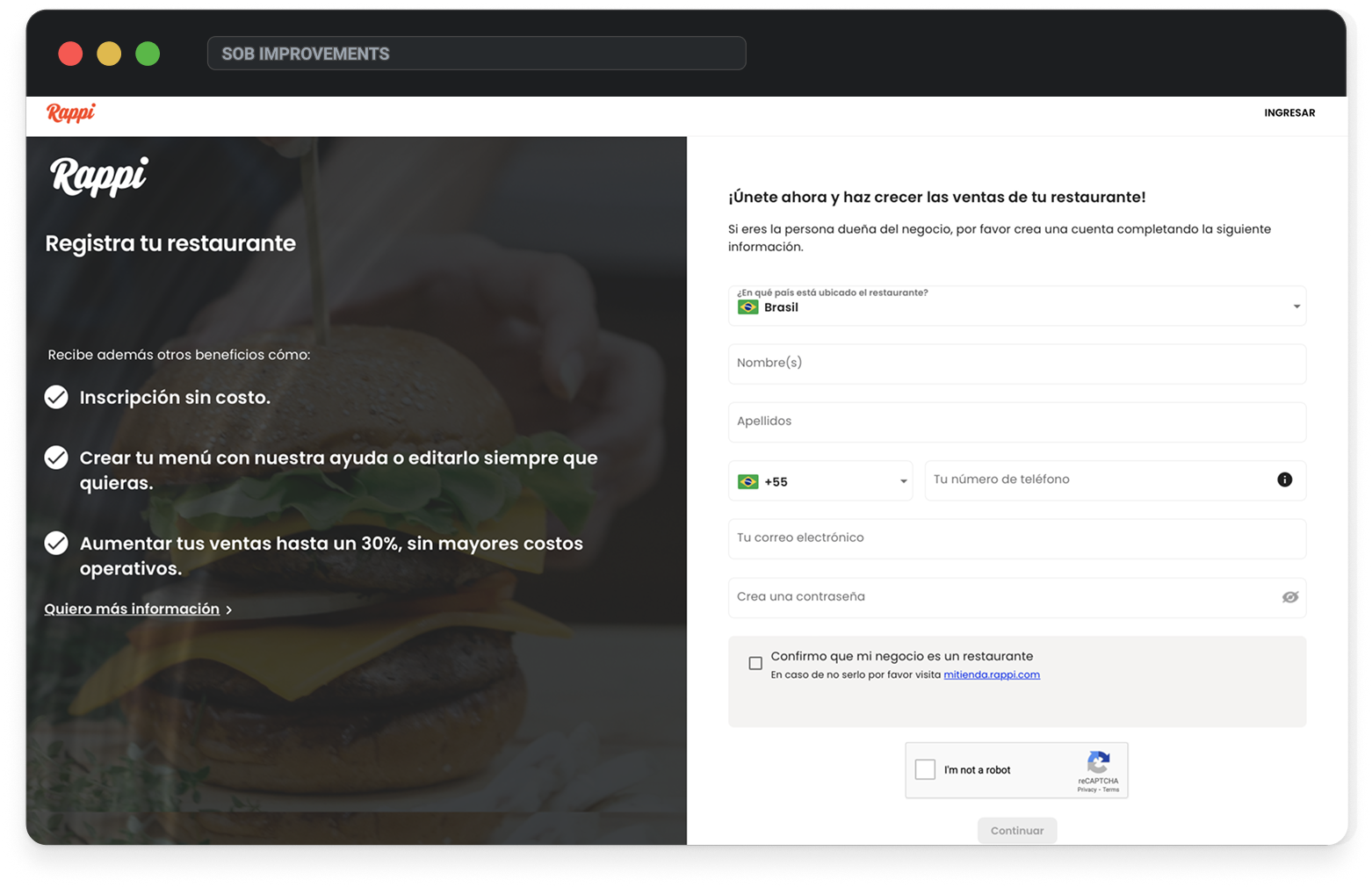
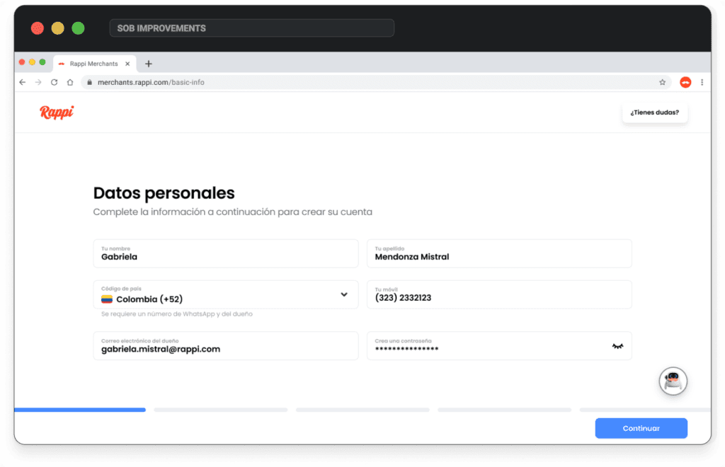
Sign up: leads
The original sign-up was disconnected and inconsistent in UI. I unified the design with a simple, mobile-friendly phased flow that captures more relevant data—beyond just name, email, and country—helping generate higher-quality leads.
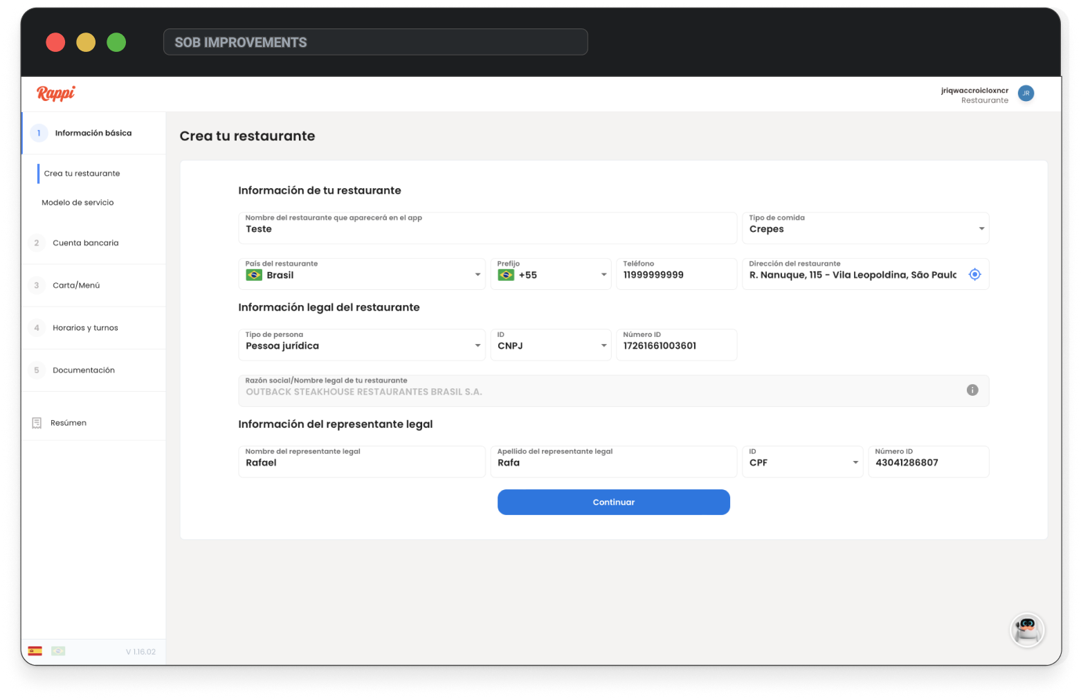
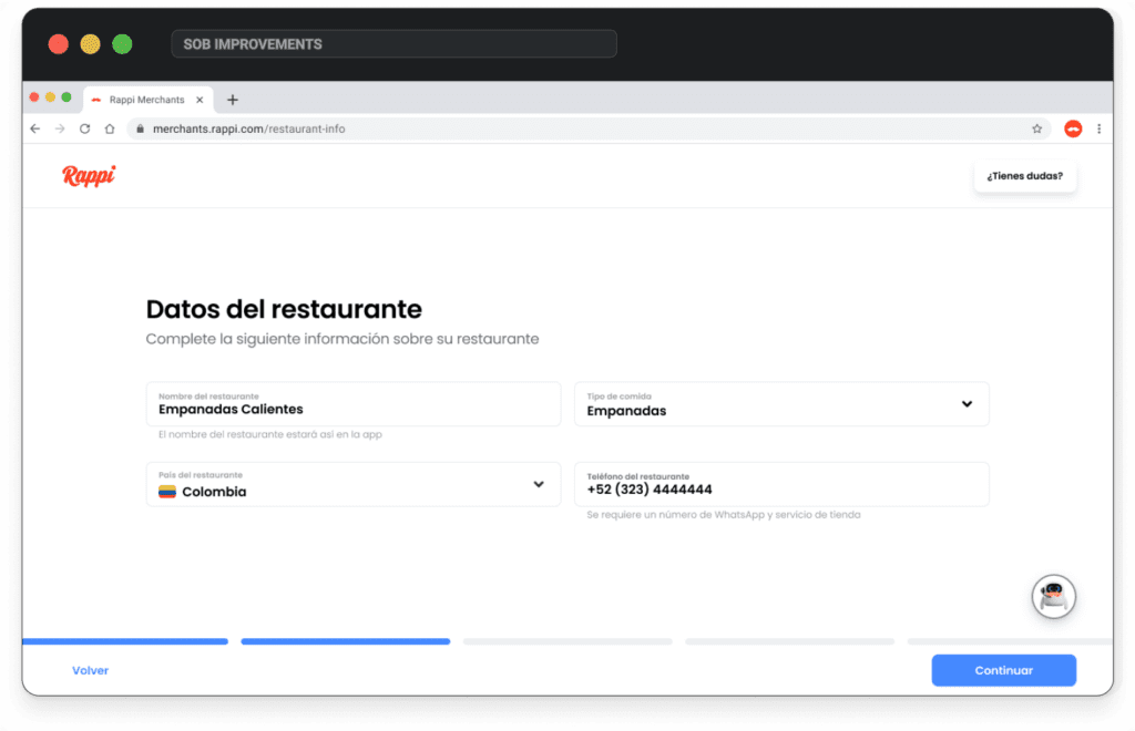
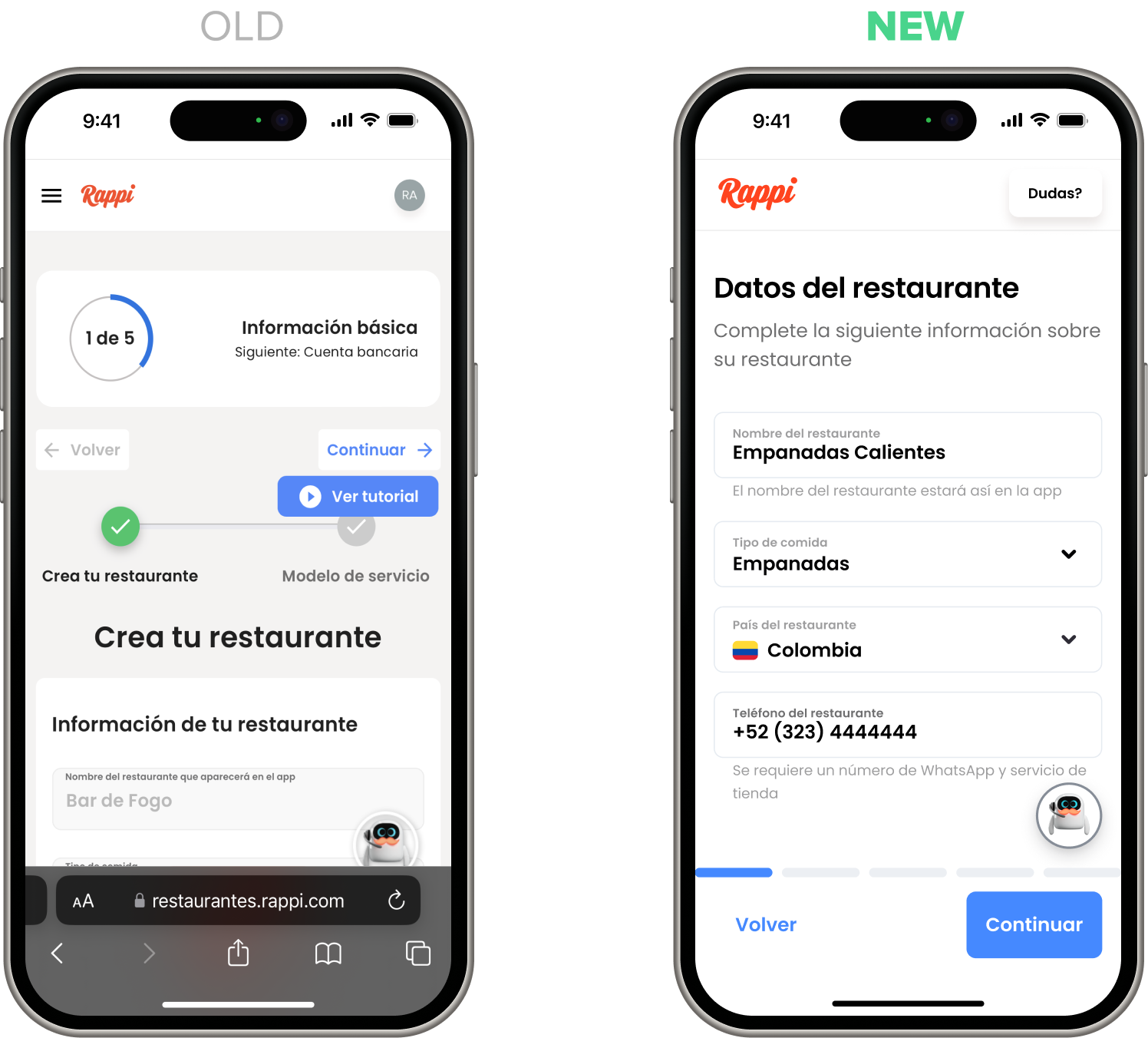
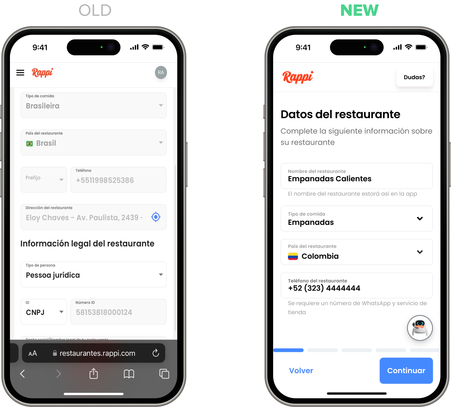
Sign up: restaurant
This step had a messy layout—too much information at once, poor grid structure, tiny inputs for long answers, and oversized fields for short ones. I simplified it by focusing only on essential restaurant info and breaking the rest into clearer, more manageable steps.
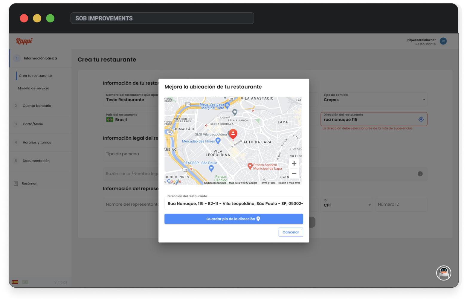
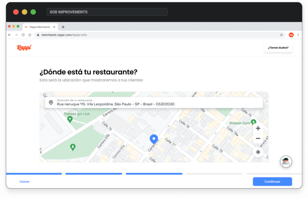
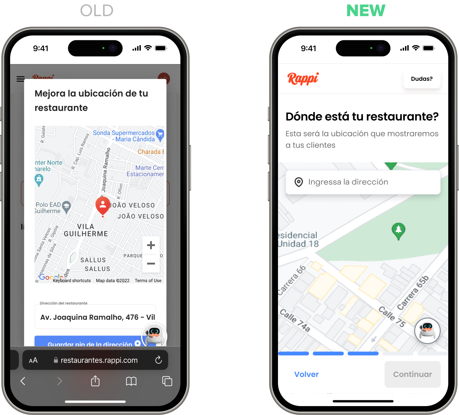
Sign up: location
The old flow had a tiny input, broken suggestions, and a hidden, buggy map modal that confused users. I redesigned it with a map experience similar to Google Maps—featuring suggestions, manual pin, and location detection—making it clear, usable, and reliable.
Loading animation
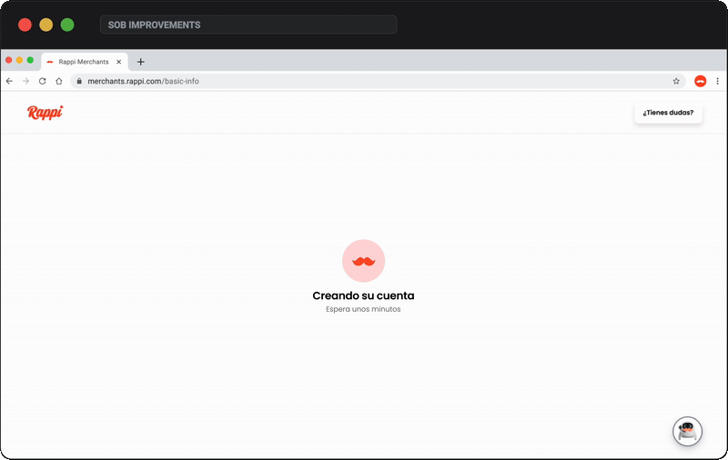
The old flow had too many redirects and login requests, disrupting the experience and causing user confusion. I worked with the tech team to streamline it behind an animation with automatic login, showing clear progress steps like creating account, preparing space, and almost ready.
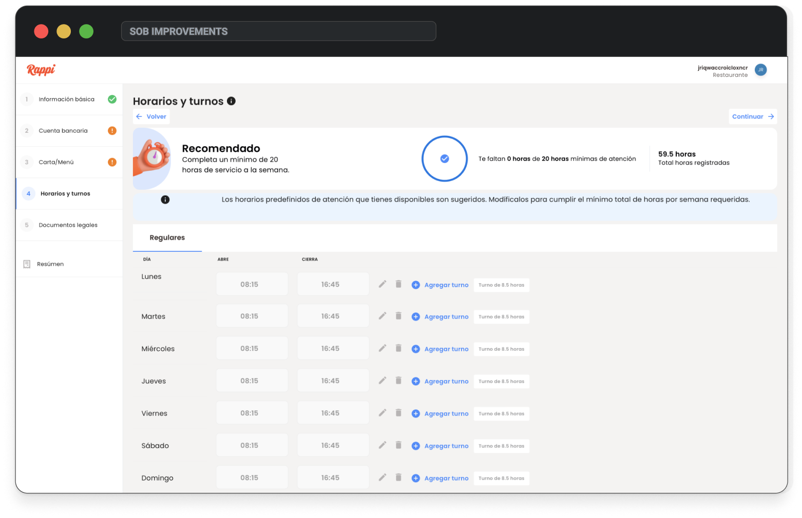
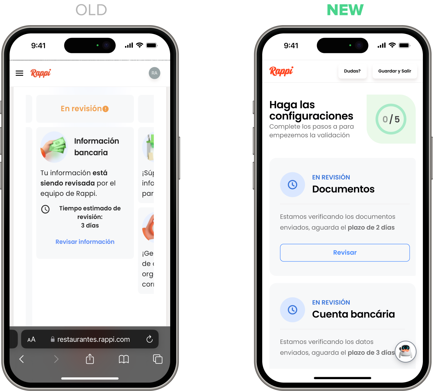
Store Setup: general
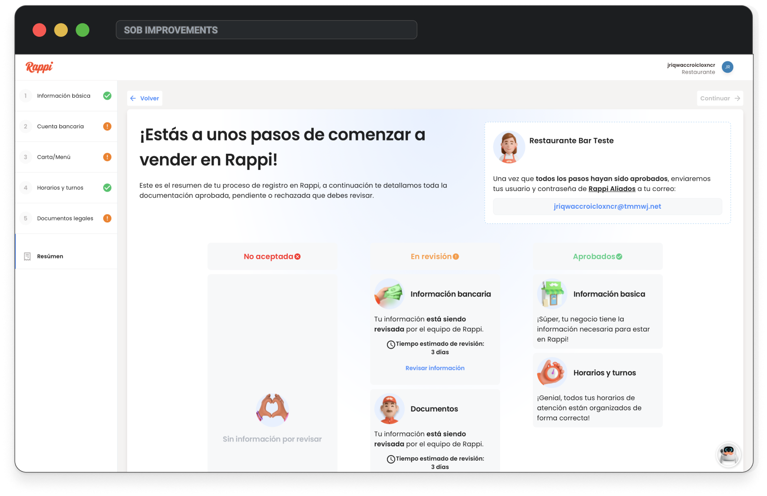
The old version used a confusing stepper with repeated statuses and showed premature info like external logins before users had completed onboarding. I redesigned it into a cleaner, responsive layout focused on usability—guiding users to complete sections at their own pace with clear progress and no distractions.
Store Setup: cards
statusThe old flow had a tiny input, broken suggestions, and a hidden, buggy map modal that confused users. I redesigned it with a map experience similar to Google Maps—featuring suggestions, manual pin, and location detection—making it clear, usable, and reliable.
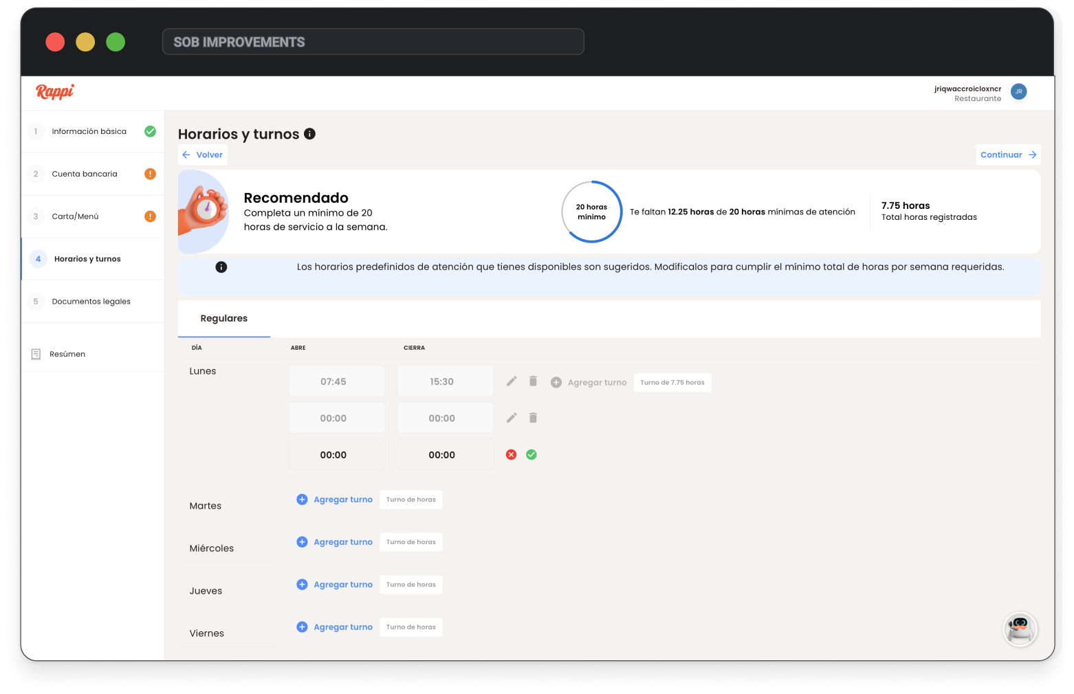
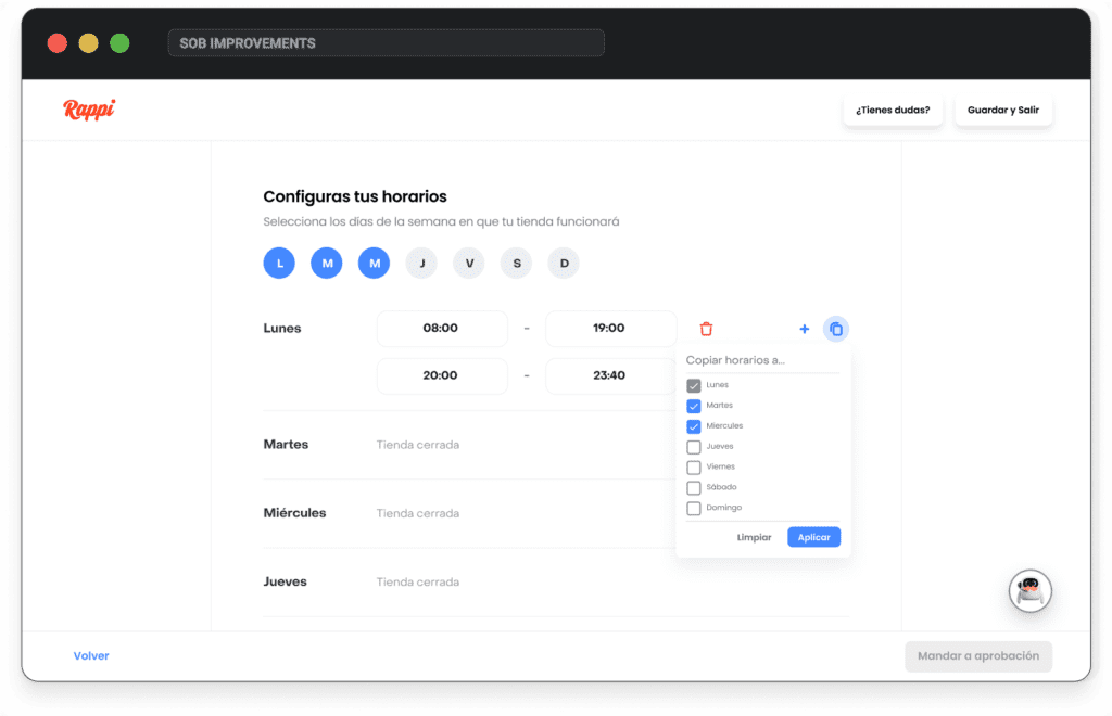
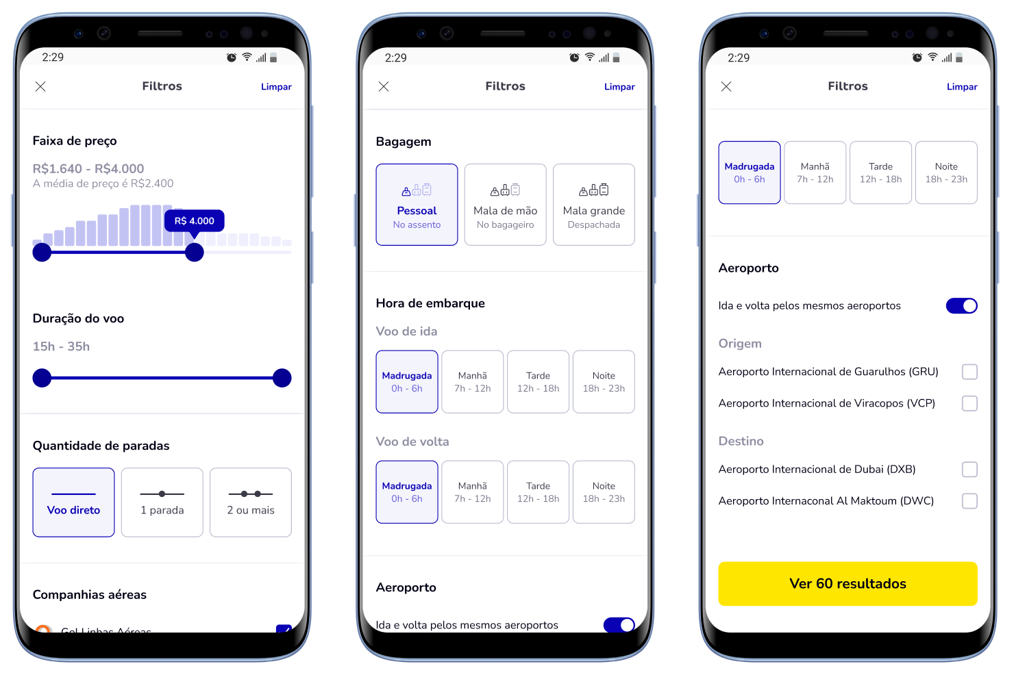
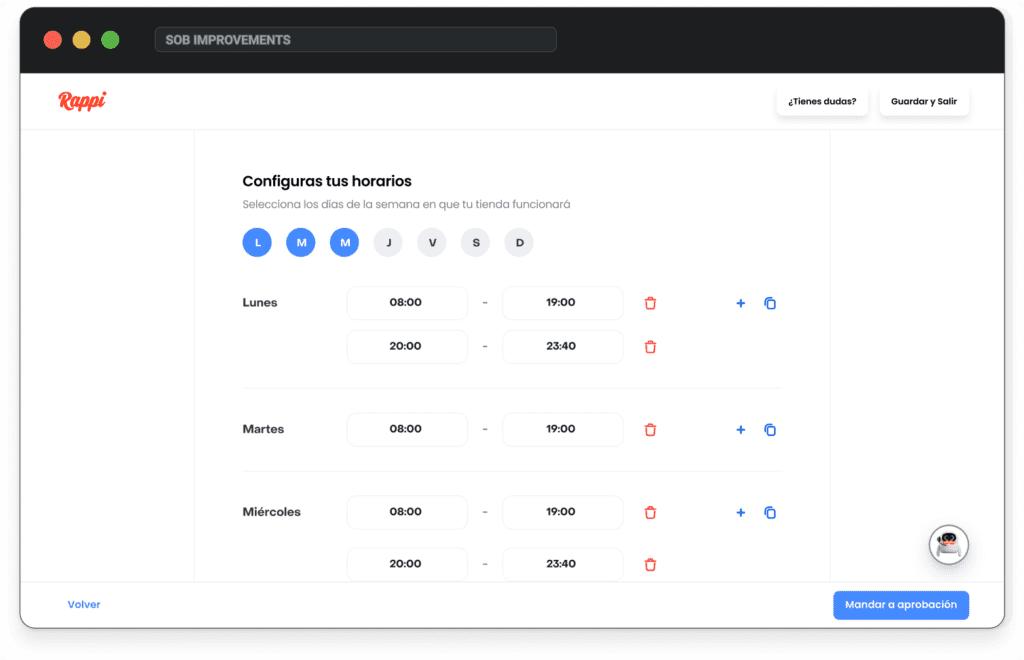
Store setup: hours
In the old version, users had to open and save each day and time field individually, making a simple task unnecessarily time-consuming. To compensate, the business pre-filled default hours, which caused more confusion than help.
Store setup: hours
I redesigned the flow with a more intuitive and efficient experience, similar to Calendly. Users now select only the days their store is open and can set hours for those days. They can also copy one day’s schedule across others with a single click—no need to open or save each field, significantly speeding up the process.
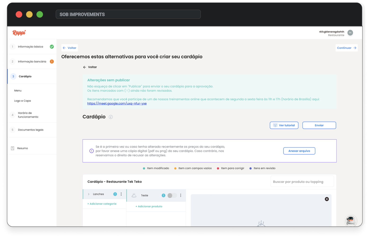
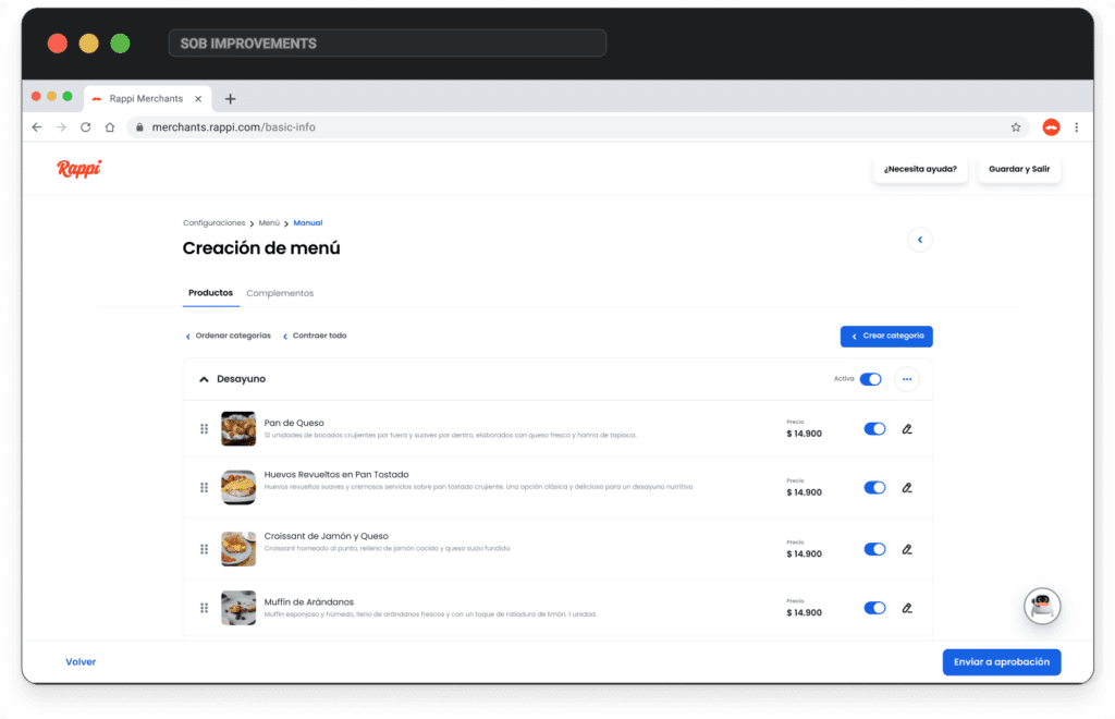
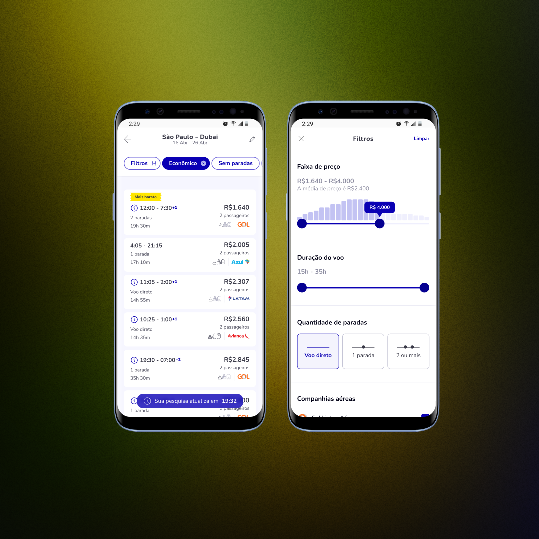
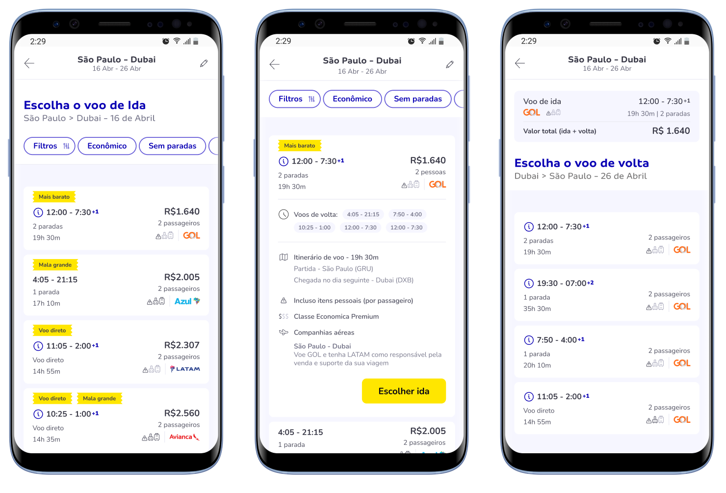
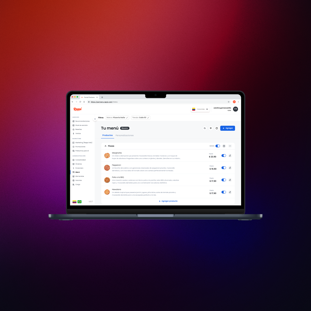
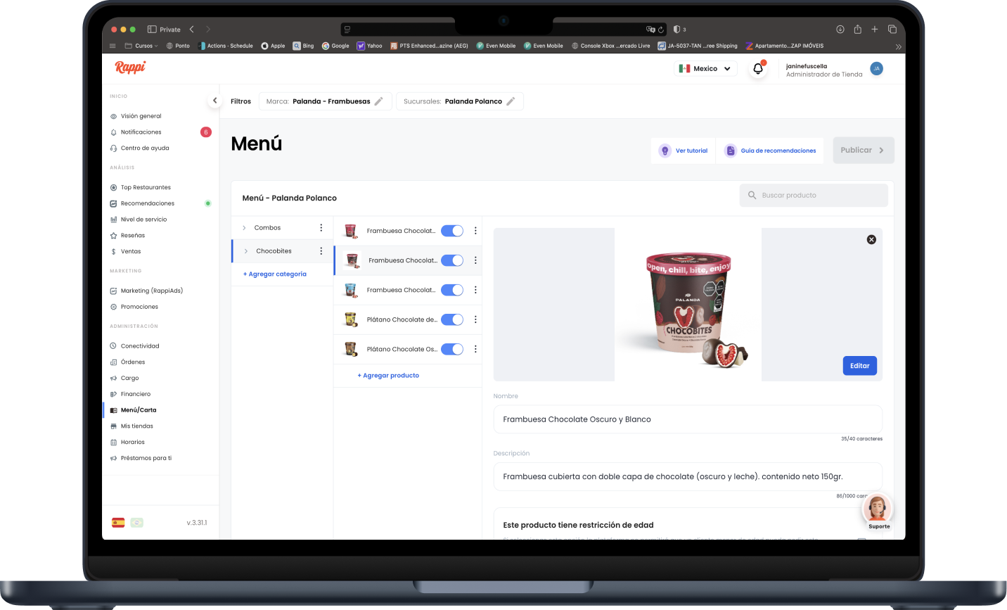
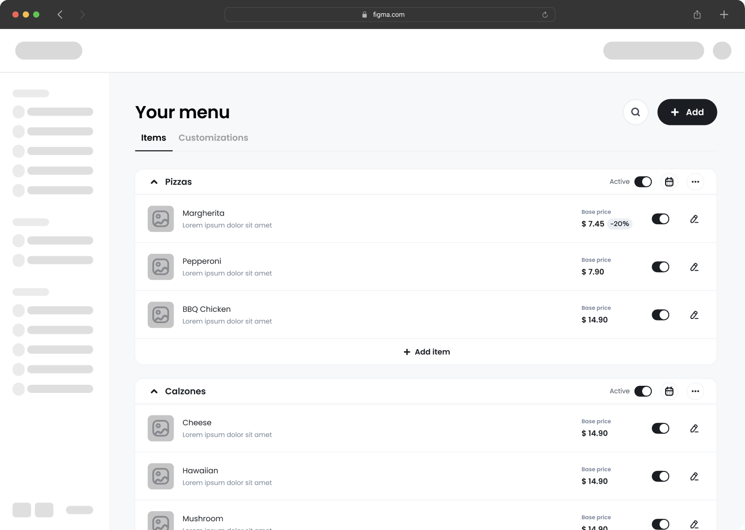
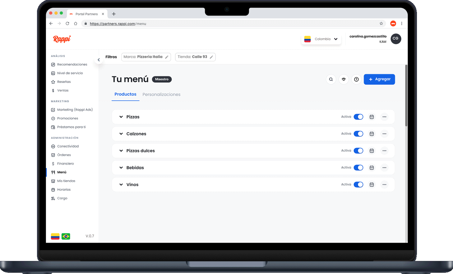
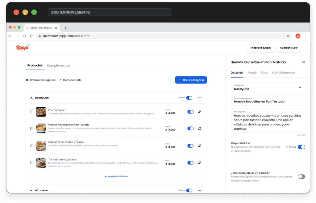
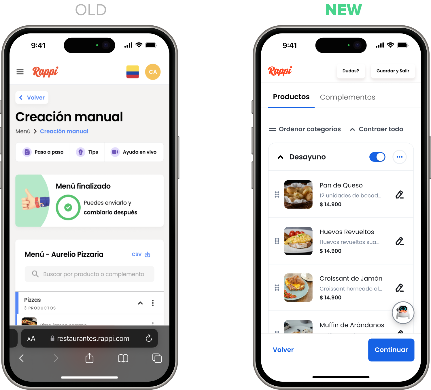
Store setup: catalog
The old catalog made it impossible to compare items efficiently. Users could only view one product or category at a time, which disrupted their workflow. I redesigned it with a vertical layout that displays key product details—image, name, description, price, and availability—enabling easier comparison and better decision-making.
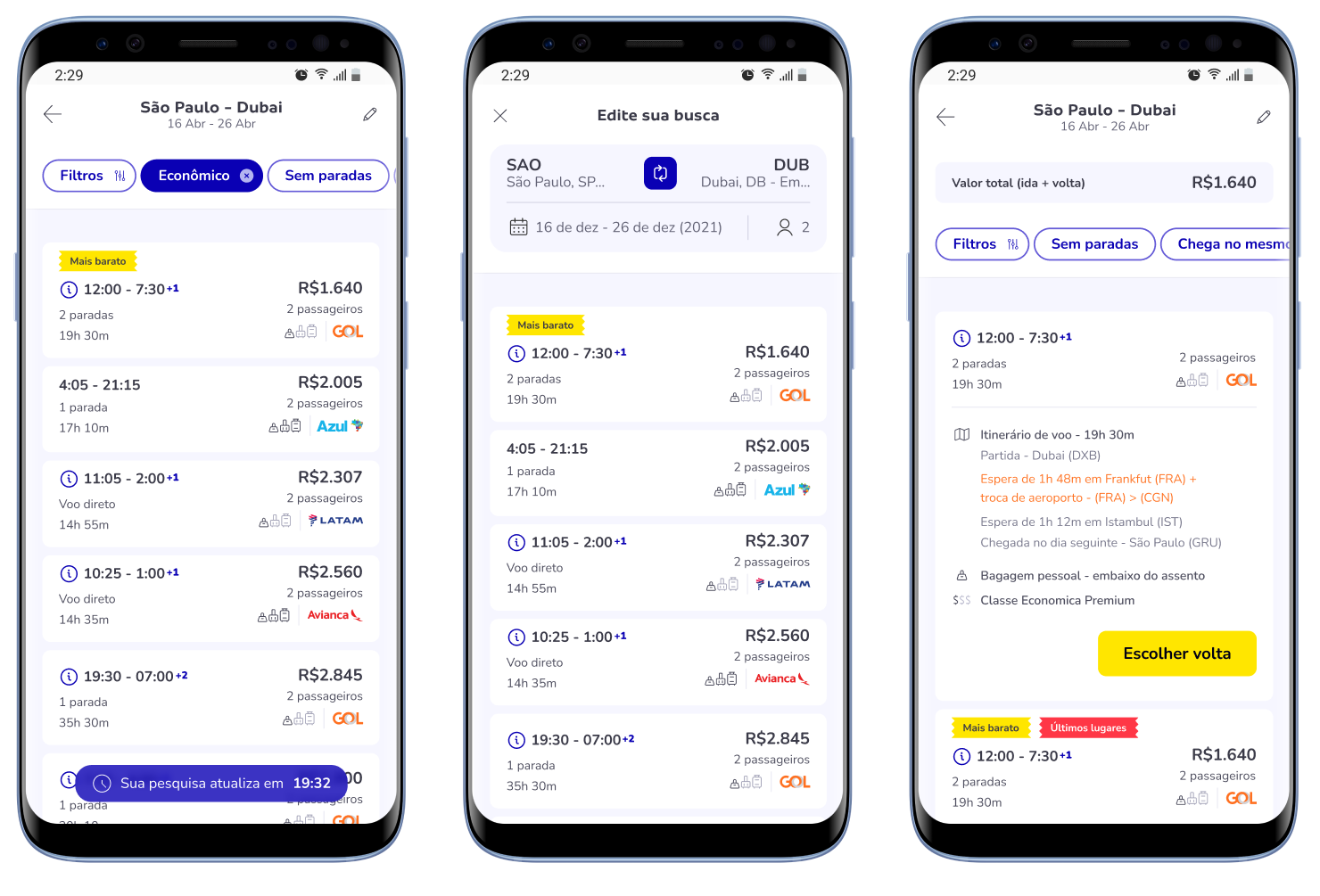
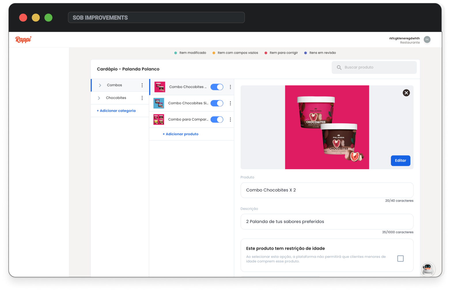
Store setup: catalog
In the new version, users can edit products without leaving the catalog view. This side modal allows them to continue browsing or comparing other items while editing, a common need when creating similar products. The modal also adapts perfectly to mobile, simplifying both the user experience and development effort.
MOBILE VERSION
Landing page
On the mobile landing page, the goal was to simplify the layout by making key elements more accessible. We added a responsive banner — which was missing in the previous version — and moved all login and register buttons into the sidebar. Each section now focuses on a prominent button that guides users toward the main action of the page: registration.
Sign up: general
The goal was to make the sign-up flow more mobile-friendly by reducing excess content and dividing it into clear categories like user info, restaurant, location, legal representative, and plan—making the process easier and less cognitively demanding.
Sign up: scrolling
The previous version grouped all sections into a single long page, requiring over three full scrolls on mobile. It mixed unrelated content—like placing a map between personal and business details—causing confusion and poor usability. We restructured the flow into clear steps, improving clarity, focus, and overall navigation.
Sign up: location
The location step was hidden in a long form with a vague icon and a small field. The map opened in a scrollable modal, making it hard to drag the pin and impossible to type an address. I redesigned it to be full-screen, responsive, with clear interaction and better suggestions—similar to Airbnb or Google Maps.
Store setup
The old kanban layout scrolled in all directions, cut off content, and wasn’t mobile-friendly. I replaced it with a vertical, responsive layout where cards stack naturally on mobile, making the experience cleaner, clearer, and easier to navigate.
Products catalog
The catalog had small images, tiny text, and too much clutter. I simplified it with large buttons, essential info only, and bigger images for better visibility. Editing now opens a full-screen view—fully optimized for mobile.
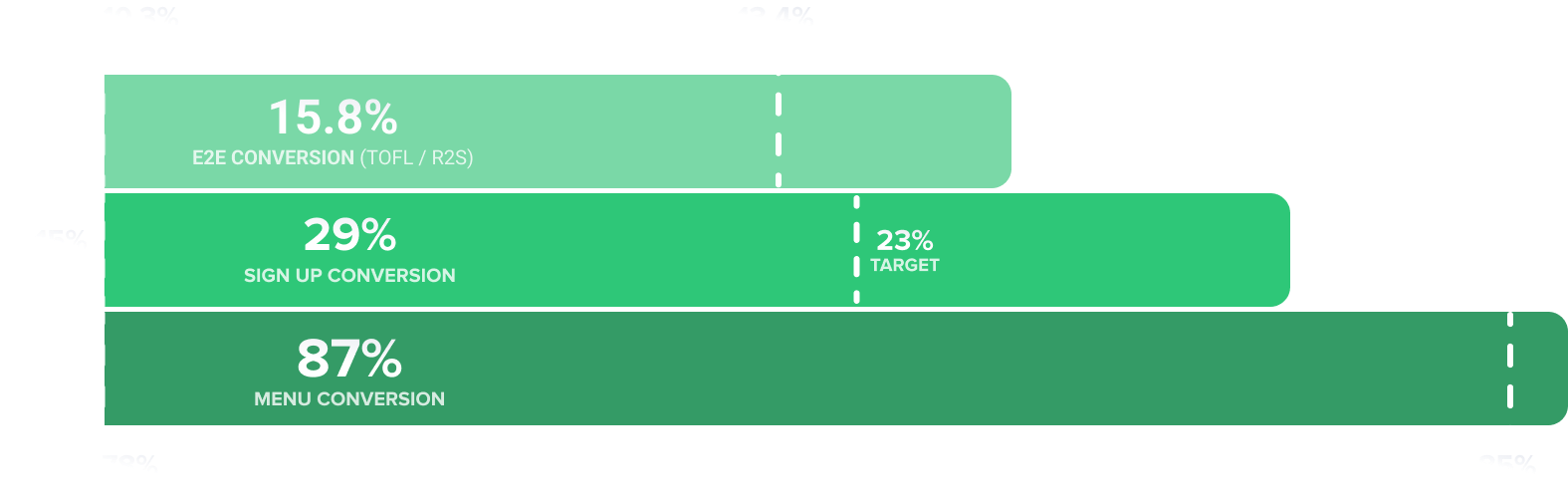
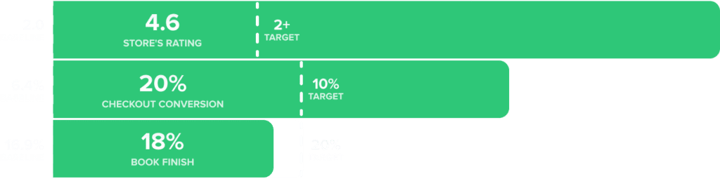
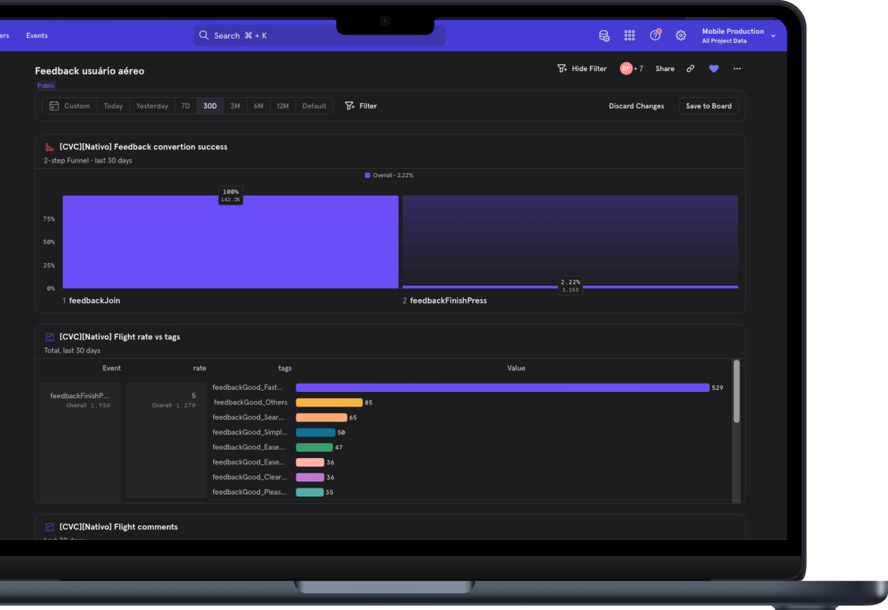
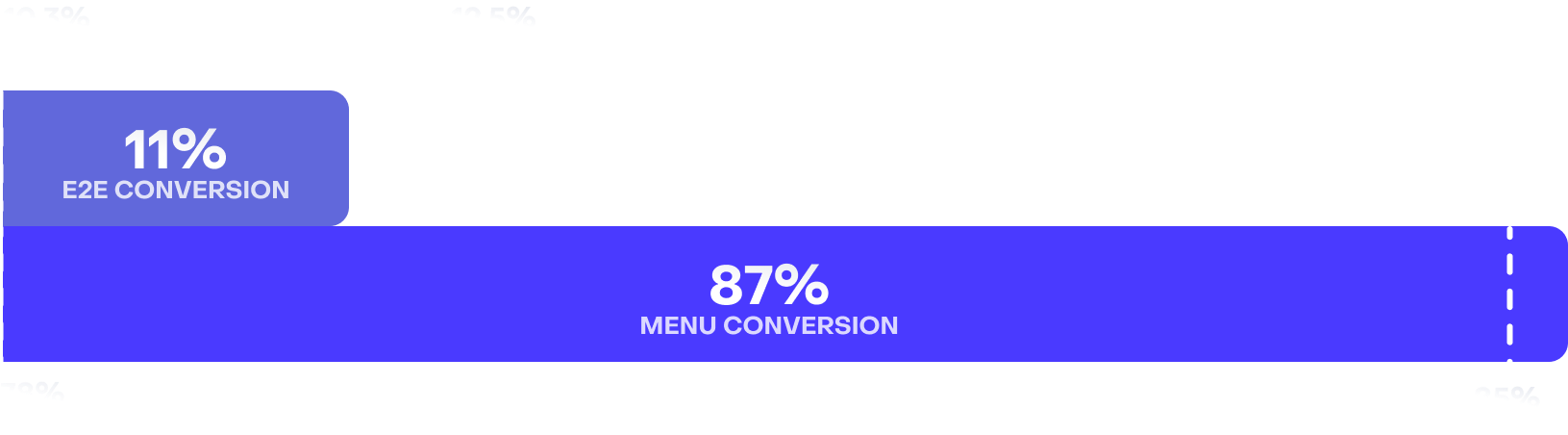
RESULTS
By delivering all the redesigned packages, we achieved strong, measurable results. In the end-to-end flow, we surpassed the 13.4% target and reached 15.8% conversion. Sign-up conversion increased from a 23% goal to 29%, and menu conversion hit 87%, exceeding the 85% target. Fixes in the product catalog and document flows had major impact, and the improvements opened space for a dedicated future project. All metrics were tracked using Amplitude, showing direct contribution to the company’s key goals.